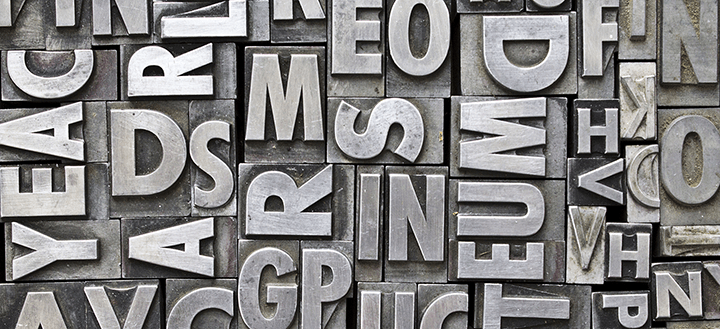
Typography is an important design aspect that is often overlooked when creating websites, blog posts, premium content, newsletters, ebooks, promotional materials, and more. Many people hear the word ‘typography’ and panic, but if you are aware of a few key concepts and use some very basic techniques, you can transform both the readability of your content as well as the tone of your digital/print voice.
In this post we’ll go over some of those key concepts and give you some introductory tips to start building your brand with typography.
Why it’s important:
Using typography can transform a reader’s experience. Instead of presenting him/her with a wall of text, typography allows you to guide a reader through your content. You can highlight important information, group sections together with clearly marked headers, make quotes pop out, and more. By formatting your content with typography, you are creating a more inviting space for members, customers, and fans to enjoy.
Additionally, typography is a great way to ensure brand cohesion and effectively communicate your unique voice on the web or in print. By consistently using one or two typefaces in your branding materials (logo, business cards, social media icons and banners, flyers, etc.) you can unify all your various platforms for communication with one overarching tone or voice.
A few definitions
Before we dive into specific tips and uses of typography, let’s define some important terms.
Font vs. typeface
Although these two terms might seem interchangeable, each refers to a different aspect of typography. A font refers to the physical file or each individual manipulation of text. The term font was originally used to describe each distinct set of keys used for analog printing in the olden days. For example, bolded Times New Roman in size 12 is a different font from italicized Times New Roman in size 10.
In contrast, typeface refers to the entire family of fonts. For example, Times New Roman as a whole is a typeface. A great way to think about it is using the analogy of songs on an album: many songs make an album just as many fonts make up a typeface.
Serif vs. Sans Serif
A serif typeface is one that has little feet at the end of the letters. Some common examples include Times New Roman, Georgia, and Garamond. Serifs are great for long blocks of text (e.g. in books and magazines) because each letter is distinctly marked and separated.
A sans serif typeface literally means ‘without serif' or without the little feet. Some examples are Arial, Verdana, and Futura. Sans serif typefaces generally feel more modern and casual, and so they are extremely popular for blog posts and other web content.
What you’ll need
To get things started, you’ll only need a handful of typefaces. My personal recommendation is 1 header typeface, 1 paragraph typeface, and 1 decorative typeface. Remember that each typeface has various fonts within it to give you the look and feel for each part of your website or branding material.
The header should be something that stands out and is easy to read. Most people tend to choose something that is bold and looks good at a larger size. If the font is not naturally bolded, you can generally tinker with the weight of the font to get the level of intensity you need.
On the other hand, paragraph text should be lighter. When deciding between serif and sans serif for that majority of your text, consider how your readers will be viewing your content as well as the type of content you produce. Is your content text heavy? You may want to consider a serif. Do you mostly produce content to for the web? Sans serifs are more flexible across a wide range of screen resolutions. Whether you’re working with a designer or on your own, play with different combinations and fonts to find the style that best matches your unique voice and needs.
Lastly, if you are in the beginning stages of branding, you may want to choose a decorative typeface that complements your header and paragraph typefaces. Decorative typefaces are used for things like logos and web/social banners. When choosing a decorative font, be sure that it is optimized for both web and print, especially if you plan on printing business cards or other promotional materials.
The typefaces and fonts you choose for your website or brand will define a hierarchy on your page. Instinctively, a reader’s eyes are drawn first to big, bold text – that’s why the norm is to use large, bold text for titles and headers. Quotes are often inset into paragraphs, enlarged, and styled in italics, which also draws the reader’s eyes towards them. When used correctly, a web page’s hierarchy allows a reader to jump from section to section obtaining the most important information without actually reading everything.
Finding fonts
Once you’re ready to start previewing, downloading, or even purchasing typefaces, you might find yourself a bit overwhelmed with the number of options available to you. A few of my personal favorites include Google Fonts, DaFont, and Adobe Typekit. If you’re looking for something a bit edgier or off the beaten path, check out this great list from Creative Bloq.
How are you guys using typography for your businesses? Have a question? Drop it all in the comments below. We love hearing from you!


Add a Comment