Want to turn more of your visitors into subscribers? A sales or membership landing page focused on signing up new members may be just what you need for your product. It’s an effective means of increasing conversions.
But how do you produce an effective landing page that really makes a difference?
In this post, we’ll look at why you should create a landing page for your membership site, and we’ll discuss the tools and solutions available to help you create one.
And best of all, we’ll analyze the features that will produce the type of landing page that will successfully grow your membership project.
Why Does Your Membership Site Need a Membership Landing Page?
Your membership site may be receiving traffic but not getting a high number of signups. It could well be that your final marketing hurdle—closing the sale—is not up to par. This’s where a landing page comes in.
The whole purpose of a landing page is to get people to take action. With a membership site, the job of a landing page is to encourage people to subscribe to your site. A high-converting landing page could be just the ticket for your business.
A landing page stands apart from your site and has different features. It may not have a header, footer, or sidebars, and the information available on the page is focused solely on persuading visitors to sign up.
The landing page isn’t where visitors go to check out your latest blog posts or read your about page. Everything displayed on the page is specifically designed to guide your audience toward one thing—conversion.
So how exactly do you create a membership landing page with the single, focused objective of getting people to sign up? Keep reading to find out!
How to Get Started
Many WordPress themes, particularly up-to-date themes, include a landing-page template. If you’re buying a new theme, check the features list to see if a landing page is included.
If you’ve purchased or are using a theme with no landing page, don’t worry. There are WordPress plugins and solutions you can use instead.
The Divi Builder

The Divi Builder, from Elegant Themes, is an impressive tool. This drag-and-drop page-builder plugin can be used with any WordPress theme and has endless possibilities for creating your own, custom-designed landing page.
Divi offers a good selection of relevant modules to choose from, like a pricing table module, a countdown timer, and call to action (CTA) module. Using it, you can create a landing page to specifically suit your site’s needs. And Divi Builder now includes a leads tool where you can easily compare different versions of your pages to see which are delivering the best results.
Elementor
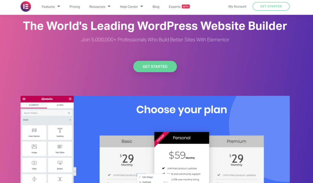
Like Divi Builder, Elementor is an easy-to-use drag-and-drop page builder that can be used with just about any WordPress theme.
The tool also includes a landing page template library of more than 200 professionally designed pages that can be customized to fit your needs.
Elementor also has a host of other features for editing, design, marketing, and WooCommerce, plus a ton of integrations.
Leadpages
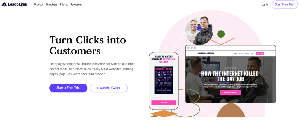
Leadpages is another notable option for landing-page creation. With over 350-plus templates to choose from and a drag-and-drop customization option for budding designers, producing a stunning landing page in little to no time is a snap. Crafted with best practices in mind, Leadpages templates are designed for conversion.
What Makes a Successful Landing Page?
There are many different features you should include to create a landing page that converts. Since everyone’s landing page will look different, you’ll need to decide what to include on yours based on your individual needs.
The key is not to go overboard with anything that might distract your viewers from the end goal. Remember, you want your readers to sign up to your site. Everything on this page should encourage them to do so.
Always keep your site and its audience in mind in the creation of your landing page—what type of site is it, what are you selling, and what things will your viewers respond to?
With that in mind, let’s consider some of the features you can use on your landing page.
Call To Action (CTA)
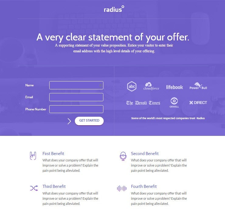
The most important feature of your landing page is your CTA. It can be displayed in numerous ways, but it should always be one of the first things a visitor sees when they arrive at your page.
Your CTA button should be large and eye-catching. You can display it right away or farther down the page following your sales copy.
Just make sure it draws attention and remains “above the fold” (visible without the user having to scroll down the page).
Use arrows or other graphical elements to highlight the button to draw visitors to it.
Attractive Design
An attractive design will impress your audience and represents your membership site as a professional and reputable business. If you’re a web designer, creating a landing page can be a fun and exciting project.
However, if you find landing-page design a challenge, use a template. These can look just as good, if not better, than custom-designed landing pages. They’re produced especially to optimize conversions. The best landing-page tools, like those we covered earlier in this article, provide a good selection of templates.
High-Quality Copy
Your text or written copy needs to be precise and to the point. Less is definitely more here. That said, make sure you include all the necessary information your audience needs to make the decision to sign up. Highlighting the key features you’re offering or reminding your readers of key points will help drive conversion.
Promotional Video
Use a video that displays individual pages from your site, with a voice-over detailing the benefits of each. This will appeal to visual learners—those who prefer to watch rather than read.
Be sure to explain what your audience will receive and how they’ll benefit from it, and create content that’s engaging and personal. This is your chance to sell your membership site.
Strong Images
Strong images catch viewer attention. Screenshots of your membership site are an effective way to draw interest and impress your audience. Use visually appealing images to break up text or as a replacement for text altogether.
Pricing Comparison Table
Use a pricing-comparison table to show how your site compares with your competitors’ sites. If you include not just the pricing but the features you offer, your audience will see that even if you are more expensive, it’s because you offer so many valuable extras.
Countdown Timers
Using a countdown timer creates a buzz and excitement around your membership site. Try offering a course for a limited number of days or at a discounted price for first subscribers. A countdown timer puts people under pressure and pushes them to purchase.
OptinMonster offers a great countdown timer that’s definitely worth checking out. Plus, with the OptinMonster MemberPress integration, MemberPress users can now add timers to their MemberPress pages, courses, and more!
Testimonials
Testimonials from members of your site or from leading industry experts in your field can help sway people’s opinions.
A convincing testimonial explaining how your site has personally benefited someone is a great way to influence readers to give your site a try.
Final Thoughts
Don’t forget to monitor analytics to see how your landing page is performing. Try split testing your landing pages to best determine what design and content appeals to your audience.
When you take the time to analyze the data and adjust your display accordingly, you’ll find yourself with an optimized landing page.
A visually appealing and effective landing page is a good way boost subscriptions and bring in business. Why not give it a try?
Do you have any questions about adding a membership landing page to your membership website? Please let us know in the comments below.












Do you recommend converting the Registration page into a Landing Page, or should the registration page be separate from the landing page?
A landing page usually has a call to action like a ‘buy’ button and then sends the user off to a payment or registration page. There might be cases made to have a registration page be a landing page but I think in most cases it is not. Thanks for your comment!
He Joe. I totally agree with all of your information on the importance of creating a landing page for your membership site that includes a clear call to action. My question may be a little of topic but I would very much appreciate your expertise. What if I wanted to create my membership landing page on one domain and the actual Memberpress membership with levels on another domain. The reason being I need my landing page to load fast. Separating the two would help me accomplish this end.
The problem I’m facing is connecting my membership landing page to my actual membership and membership areas. What is the best way to approach this configuration. Can you help?