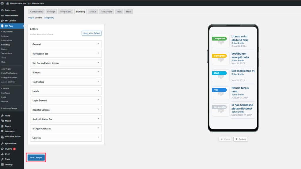
Consistent brand colors enhance app design, reinforce identity, and improve usability. MemberPress AppKit colors settings enable customization of backgrounds, buttons, navigation elements, and content highlights.
This document explains how to configure color schemes for all app sections and preview changes across iOS and Android platforms.
Understanding Color Configuration
Color settings control visual appearance throughout the app, including backgrounds, text, buttons, navigation bars, and interactive elements. Each color setting affects specific interface components. Real-time previews display color changes on iOS and Android mockups. Proper color configuration ensures brand consistency and maintains readability across different screen contexts.
Accessing Color Settings
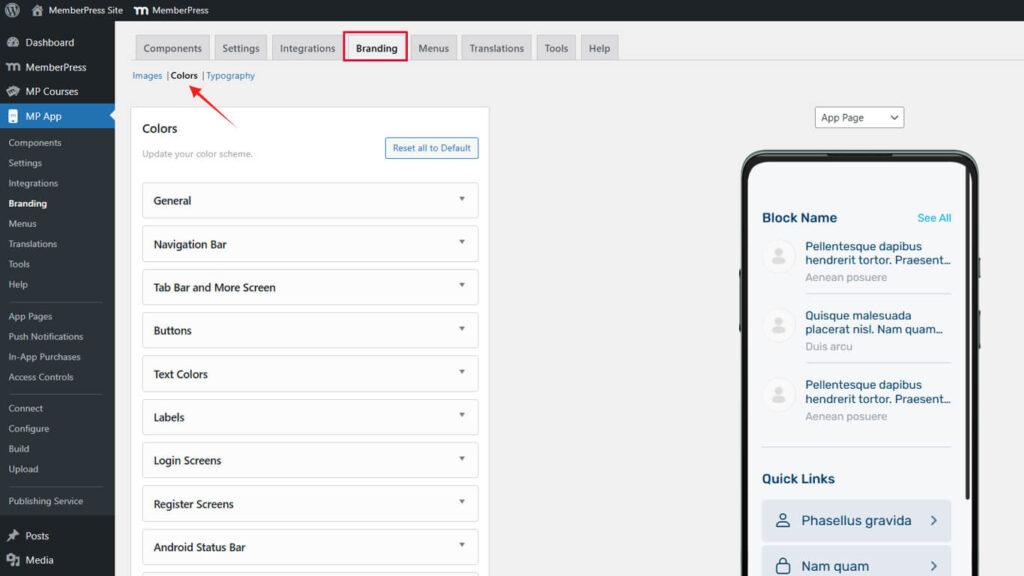
All color configuration occurs within the branding colors interface.
- Navigate to Dashboard > MP AppKit > Branding > Colors.
Configuring General Colors
General colors define primary interface elements throughout the app.
- Navigate to Dashboard > MP AppKit > Branding > Colors.
- Locate the General section.
- Click the Background Color swatch.
- Select a color using the color picker or enter a hex code.
- Click the Alternate Background Color swatch.
- Select a contrasting color for alternate content sections.
- Click the Color Image Background swatch.
- Select a color for image placeholder backgrounds.
- Click the Border Color swatch.
- Select a subtle color for element borders and dividers.
- Click the Accent Color swatch.
- Select a prominent color for highlights and emphasis.
Changes preview immediately on App Page, Directory Page, and Menu Page mockups.
Understanding General Color Purposes
Each general color serves specific interface functions.
Background Color fills primary content areas and pages. This color should provide optimal contrast with text colors for readability.
Alternate Background Color differentiates sections or cards within pages. This color should contrast subtly with the primary background while maintaining a cohesive appearance.
Color Image Background displays behind images during loading or when images are unavailable. This color should complement typical image content without creating jarring transitions.
Border Color defines element boundaries and dividers. This color should be subtle enough not to dominate but visible enough to provide structure.
Accent Color highlights interactive elements and important information. This color should stand out prominently while complementing the overall color scheme.
Customizing Navigation Bar Colors
Navigation bar colors affect app headers and top navigation elements.
- Navigate to Dashboard > MP AppKit > Branding > Colors.
- Locate the Navigation Bar section.
- Click the Background Color swatch.
- Select a color for the navigation bar backgrounds.
- Click the Text Color swatch.
- Select a color ensuring readability against the background.
- Click the Link Color swatch.
- Select a color for navigation links and interactive text.
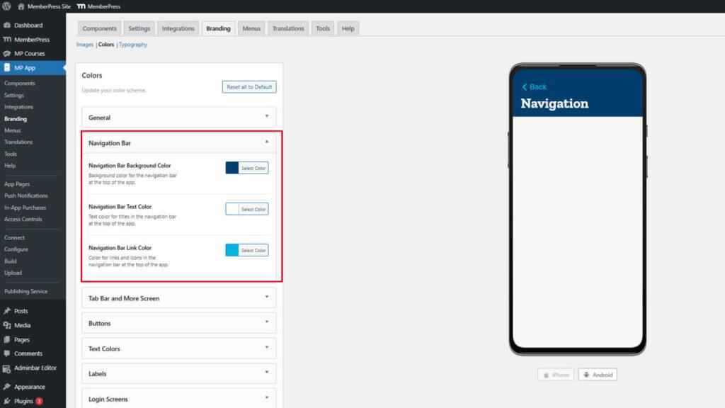
Navigation bar preview updates immediately in the header mockup.
Ensuring Navigation Readability
Navigation colors must maintain sufficient contrast for accessibility.
Styling Tab Bar and More Screen
Tab Bar and More Screen colors control the bottom navigation and overflow menu appearance.
- Navigate to Dashboard > MP AppKit > Branding > Colors.
- Locate the Tab Bar & More section.
- Click the Tab Bar Background Color swatch.
- Select a color for tab bar backgrounds.
- Click the Icon Default Color swatch.
- Select a color for inactive navigation icons.
- Click the Icon Active Color swatch.
- Select a prominent color for active navigation icons.
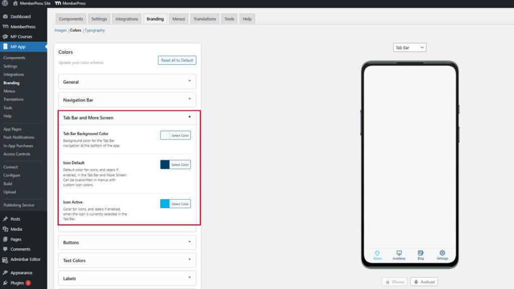
Preview mockups update to show tab bar appearance with selected colors.
Differentiating Active and Inactive Icons
Icon colors should clearly indicate the navigation state.
Active icon color should contrast strongly with the default color to indicate the current location. Members should immediately recognize which section they are viewing. Insufficient differentiation causes navigation confusion and poor user experience.
Customizing Button Styles
Button colors define the appearance of interactive elements throughout the app.
- Navigate to Dashboard > MP AppKit > Branding > Colors.
- Locate the Buttons section.
- Click the Primary Button Background Color swatch.
- Select a prominent color for primary action buttons.
- Click the Primary Button Text Color swatch.
- Select a contrasting color for button text.
- Click the Secondary Button Background Color swatch.
- Select a subtle color for secondary action buttons.
- Click the Secondary Button Text Color swatch.
- Select an appropriate text color for secondary buttons.
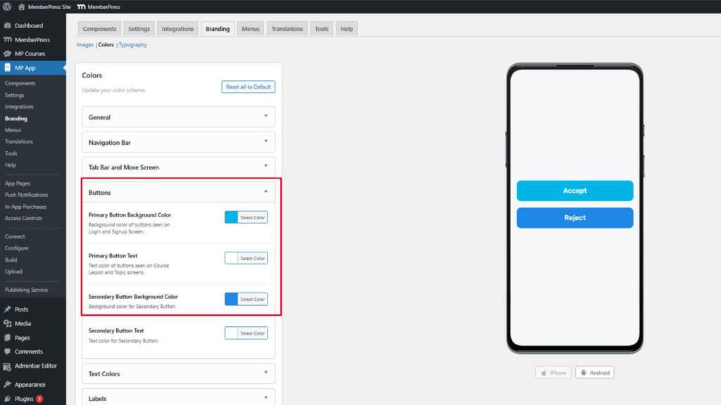
Button preview updates show how buttons appear in various contexts.
Distinguishing Button Hierarchies
Primary and secondary buttons should clearly indicate action importance.
Primary buttons represent main actions like “Purchase,” “Submit,” or “Continue.” These buttons should use bold, attention-grabbing colors. Secondary buttons represent alternative actions like “Cancel” or “Go Back.” These buttons should use more subdued colors that complement but don't compete with the primary buttons.
Adjusting Text Colors
Text colors control readability and content hierarchy throughout the app.
- Navigate to Dashboard > MP AppKit > Branding > Colors.
- Locate the Text Colors section.
- Click the Heading Text Color swatch.
- Select a prominent color for section headings and titles.
- Click the Body Text Color swatch.
- Select a highly readable color for the main content text.
- Click the Description Text Color swatch.
- Select a slightly muted color for supplementary descriptions.
- Click the Meta Text Color swatch.
- Select a subtle color for timestamps and metadata.
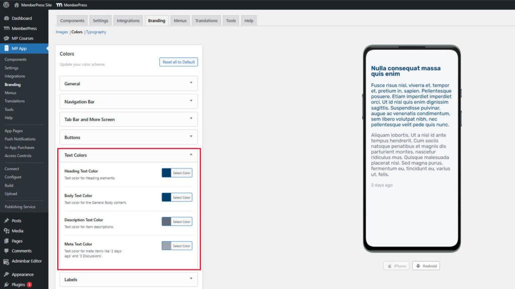
Text preview displays how different text levels appear with selected colors.
Establishing Text Hierarchy
Text colors should create a clear visual hierarchy for content scanning.
Heading text should be the most prominent to indicate section starts. Body text should offer optimal readability for extended reading. Description text should be distinguishable but less prominent than body text. Meta text should be subtle enough not to distract from the primary content.
Styling Labels
Label colors affect tags, badges, and status indicators throughout the app.
- Navigate to Dashboard > MP AppKit > Branding > Colors.
- Locate the Labels section.
- Click the Label Background Color swatch.
- Select a color for label backgrounds.
- Click the Label Text Color swatch.
- Select a contrasting color for label text.
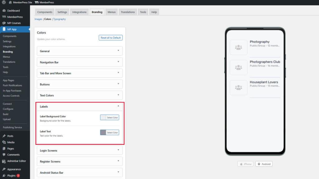
Label preview shows appearance in both list and detail views.
Ensuring Label Visibility
Labels must remain visible across different page backgrounds.
The label background color should contrast with the page backgrounds where labels appear. Label text should maintain a strong contrast with the label background for readability. Labels often appear on varying backgrounds, so color selection should account for multiple contexts.
Customizing Login Screen Colors
Login screen colors define the authentication page's appearance.
- Navigate to Dashboard > MP AppKit > Branding > Colors.
- Locate the Login Screens section.
- Configure the following color swatches:
- Background Color for the login page background;
- Input Field Background for form field backgrounds;
- Input Field Border for field outlines;
- Input Field Text for entered text color;
- Button Background for action button backgrounds;
- Button Text for button text color.
- Review both the Login and Forgot Password screen previews.
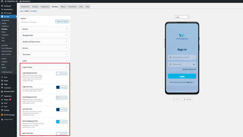
Login screen preview displays authentication pages with selected colors.
Styling Registration Screen Colors
Registration screen colors define the account creation page appearance.
- Navigate to Dashboard > MP AppKit > Branding > Colors.
- Locate the Register Screens section.
- Configure the following color swatches:
- Background Color for registration page background;
- Input Field Background for form field backgrounds;
- Input Field Border for field outlines;
- Input Field Text for entered text color;
- Button Background for action button backgrounds;
- Button Text for button text color.
- Review the registration screen preview.
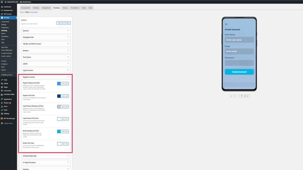
Using consistent colors between login and registration screens creates cohesive authentication experiences.
Configuring Android Status Bar Color
Android status bar color affects the device's status bar appearance at the top of the screen.
- Navigate to Dashboard > MP AppKit > Branding > Colors.
- Locate the Android Status Bar section.
- Click the Status Background Color swatch.
- Select a color that matches or complements the navigation bar.
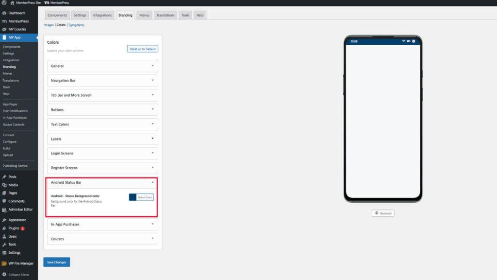
Status bar color preview updates on the Android device mockup only. This setting does not affect iOS devices.
Customizing In-App Purchase Colors
In-App Purchase colors highlight membership products and benefits.
- Navigate to Dashboard > MP AppKit > Branding > Colors.
- Locate the In-App Purchases section.
- Click the Purchased Status Checkmark Color swatch.
- Select a color for checkmarks indicating purchased memberships.
- Click the Benefits Checkmark Color swatch.
- Select a color for checkmarks listing membership benefits.
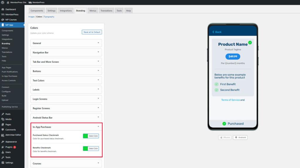
Purchase screen preview displays product listings with configured checkmark colors.
Highlighting Purchase Status
Checkmark colors should clearly indicate purchase completion and benefit inclusion.
Purchased status checkmarks should use positive, affirming colors like green to indicate successful transactions. Benefits checkmarks should complement the purchased status color while remaining distinct. Sufficient contrast with background colors ensures visibility across different screen contexts.
Saving Color Configuration
All color selections must be saved before taking effect.
- Review all configured colors in the preview mockups.
- Scroll to the bottom of the Dashboard > MP AppKit > Branding > Colors page.
- Click Save Changes.
- Wait for the confirmation message indicating successful save.
