If you want to offer different membership tiers for your website, you need a way for users to see what each has to offer. You want users to be able to easily compare features, prices, benefits, and more.
The best way to showcase all of that information is with a pricing table. Pricing tables are simple yet crucial elements for selling services and memberships online. When designed carefully, they can help you attract more members for your website.
In this article, we'll talk about why pricing tables are so important. Then we'll go over four key tips to help you design better ones for your membership website. Let's get to it!
The Importance of a Quality Pricing Table
There's a reason you see pricing tables all over the web. Tables are perhaps the best method for showcasing a lot of information in a way that enables users to compare different elements quickly:
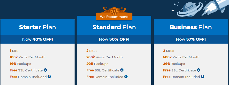
An excellent pricing table not only gives you all the details you need – it helps you decide what option is best for you. In most cases, websites use pricing tables to sell memberships or subscriptions, especially when there are different tiers available.
For your pricing tables to have an impact on conversions, however, you'll want to include several key elements. A simple, bare table probably won't do the trick when it comes to getting you new members:
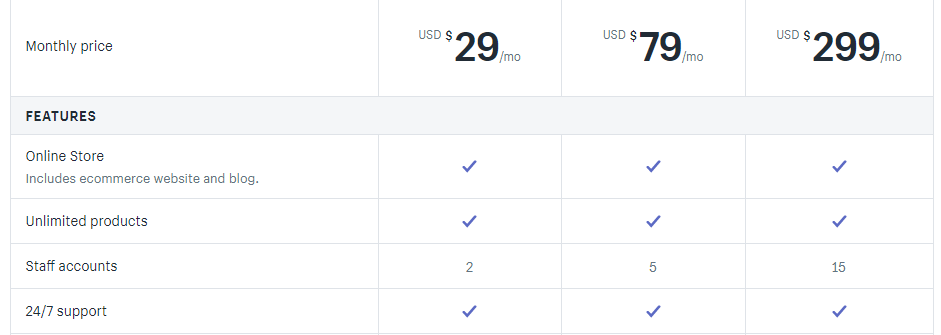
In the next few sections, we'll go over what those key pricing table elements are, and we'll talk about how you can implement them.
4 Key Tips for Creating Better Pricing Tables
MemberPress includes a built-in pricing page that is automatically created when you set your membership Groups.
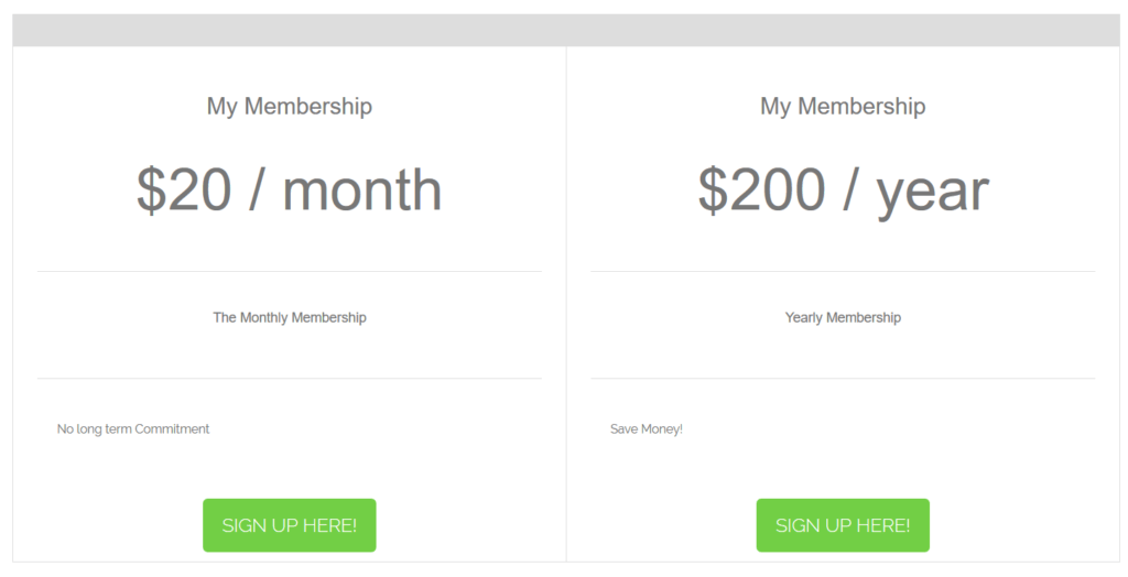
You can adjust the Pricing Page Theme to set the appearance of the pricing page to one of our pre-set designs, or you can chose Custom to use your own custom CSS.
Here, we'll focus on vital things to keep in mind as you optimize the pricing tables for your MemberPress site using custom CSS.
1. Make the Differences Between Each Tier Obvious
It's a smart idea to offer multiple memberships tiers for your website, ranging from budget-priced to more expensive options. With this approach, you can offer different benefits for each tier and maximize your profits.
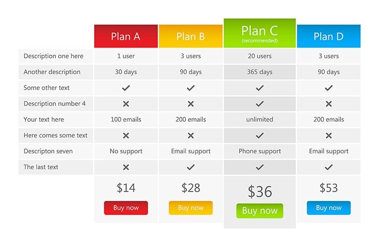
The problem is that sometimes users might not understand what exactly they're paying for with each tier. With a pricing table, you can easily highlight the differences between each plan using simple visual tricks:

Your goal is to make sure the columns on your table are easy to differentiate. Some tables do this by highlighting elements in specific columns, using different colors for each one, and so on.
The easiest way to differentiate what each tier of membership offers is through lists. Try creating a list that shows what each tier includes and adding unique elements to the bottom of each one. That way visitors can quickly spot the differences.
2. Highlight the Plans You Want Users to Focus On
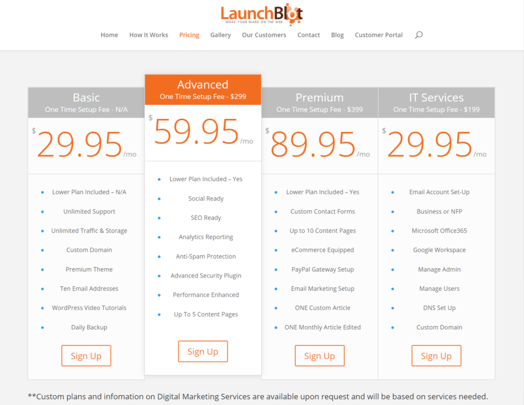
Although you may offer multiple membership tiers, you probably want visitors to focus on one or two plans in particular. That's why many of the pricing tables you see highlight specific plans:
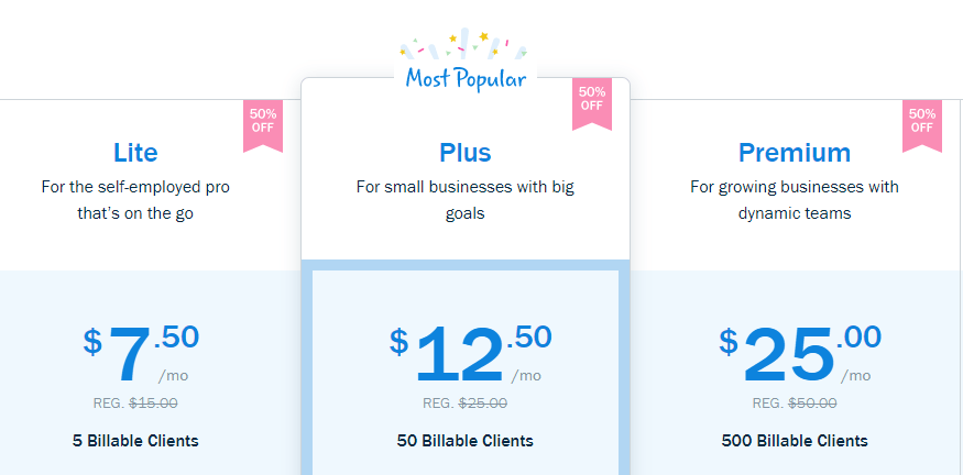
Usually, the highlighted plan or membership tier is the one that offers the best deal and gives you the best returns. Highlighting plans is a smart move, and there are several ways you can do it. Some websites add borders to specific tables or use different call to action (CTA) buttons.
Another simple trick you can use is to make one section of your pricing table bigger than the others:
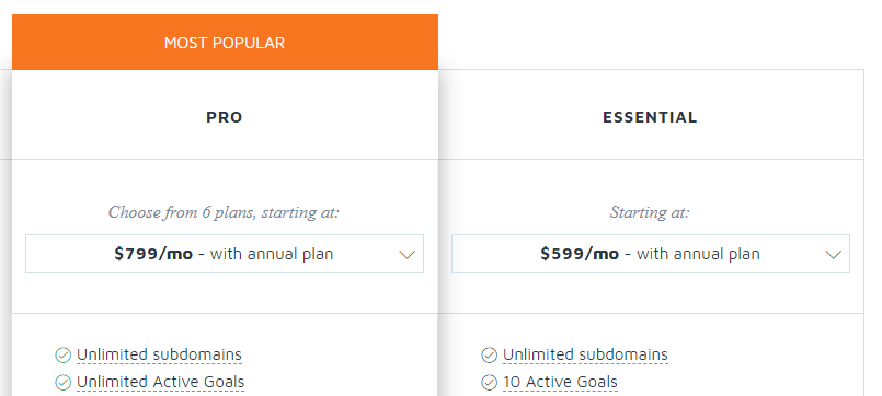
The goal is to draw the visitor's gaze to whichever membership tier you want them to sign up for. Once you have your visitor's attention, it's up to the features you offer to convince them to buy.
3. Add Hover Details for Key Features
One problem with pricing tables is that you're limited in the space you can use. If you include too much information about each feature in every membership tier, your tables will be tough to read and navigate.
An elegant solution to this problem is to add hover effects to key elements within your pricing table. In the following example, you can see that each item on the list has a question mark icon next to it. If you hover over the icon, you can read more about that particular feature:
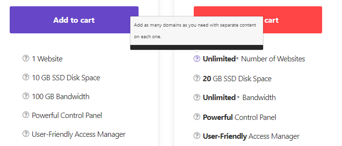
You can easily add hover ‘tooltips' to any element on your website – including pricing tables – by using CSS. It takes a bit of tinkering if you're not used to stylesheets, but it can translate to more user signups.
4. Make Sure Your Calls to Action Stand Out
One thing almost all pricing tables have in common is that they include CTAs for each plan or product on offer. That's because once you convince visitors to sign up, you want them to be able to do so immediately:

CTAs offer you a lot of opportunities to get creative. In the example above, while it's easy to see which button corresponds to each tier, the look is unexciting and plain. Instead, you can design unique buttons for every plan:

With this approach you can use more eye-catching colors on the membership tiers you want to increase sign-ups for. It's also a great way to differentiate plans visually.
Usually, CTA language on pricing tables tends to be rather direct. You'll commonly see variations of phrases such as “Get it now,” “Sign Up Today,” and “Register.” Those simple, strong words and phrases get results, so don't overthink the language you use.
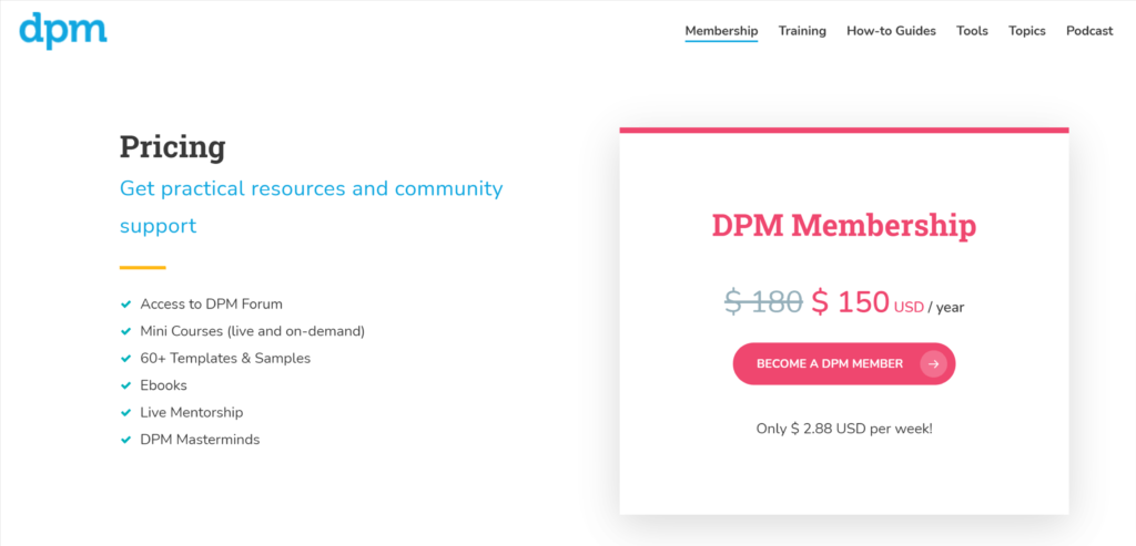
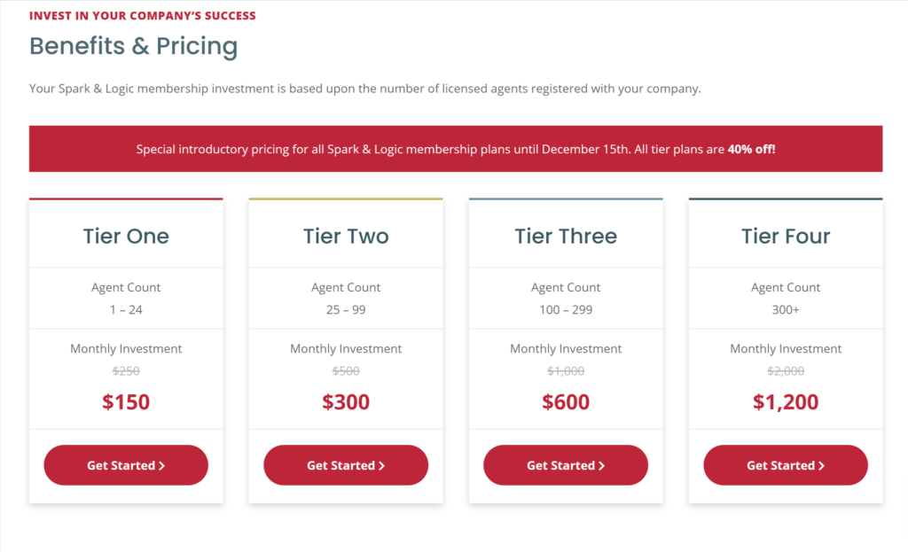
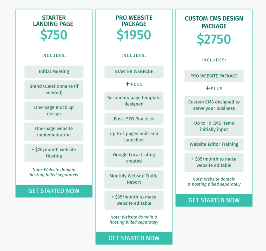
A Few MemberPress Site Pricing Table Examples

Conclusion
Offering multiple membership tiers for your website is a great idea. It can maximize the number of users you attract and increase your profits. However, it's important to convey what every tier has to offer, which is where your pricing table comes in.
If you want to create better pricing tables for your membership website, just keep these four tips in mind:
- Make the differences between each tier obvious.
- Highlight the plans you want users to focus on.
- Add hover details for key features.
- Make sure your CTAs stand out.
Do you have any questions about how to create better pricing tables for your website? Let's go over them in the comments section below!
Don't have MemberPress yet? Get started here!
If you liked this article, be sure to follow us on Facebook, Twitter, Instagram, and LinkedIn! And don't forget to subscribe in the box below.







Hi John, It would be good to link to instructions for making multiple membership offers. This article helped me realise I can offer coaching with membership at higher levels; now I’m excited to get to it!