You can design MemberPress profiles using premade Starter Patterns or create your own custom design. MemberPress Profiles are Gutenberg-based, which means you can design profiles with profile-specific blocks and any other Gutenberg block.
This document will explain how you can design MemberPress profiles to fit your webesite and branding,
Using Profile Starter Patterns
MemberPress includes four professional profile patterns as starting points:
- Profile Classic positions the member profile photo and name to the left side of the profile header. All other member information is aligned to the left;
- Profile Classic – Right mirror reflects the Classic pattern header, featuring a member profile photo and name. All other member information remains aligned to the left;
- Profile Classic – Centered aligns the member profile photo and name in the center, with all information aligned to the left;
- Profile Split Layout divides profiles into three distinct sections. The profile header is located at the top of the page, and the rest of the page is divided into two sections: left and right. Here, the member profile photo and name are located on the left. The remaining member information is located on the right.
When adding a new profile type, you will be prompted to choose one of the available Starter Patterns.
If skipped, you can add these patterns through the Block inserter:
- Navigate to the profile type, hover over its name, and click Edit.
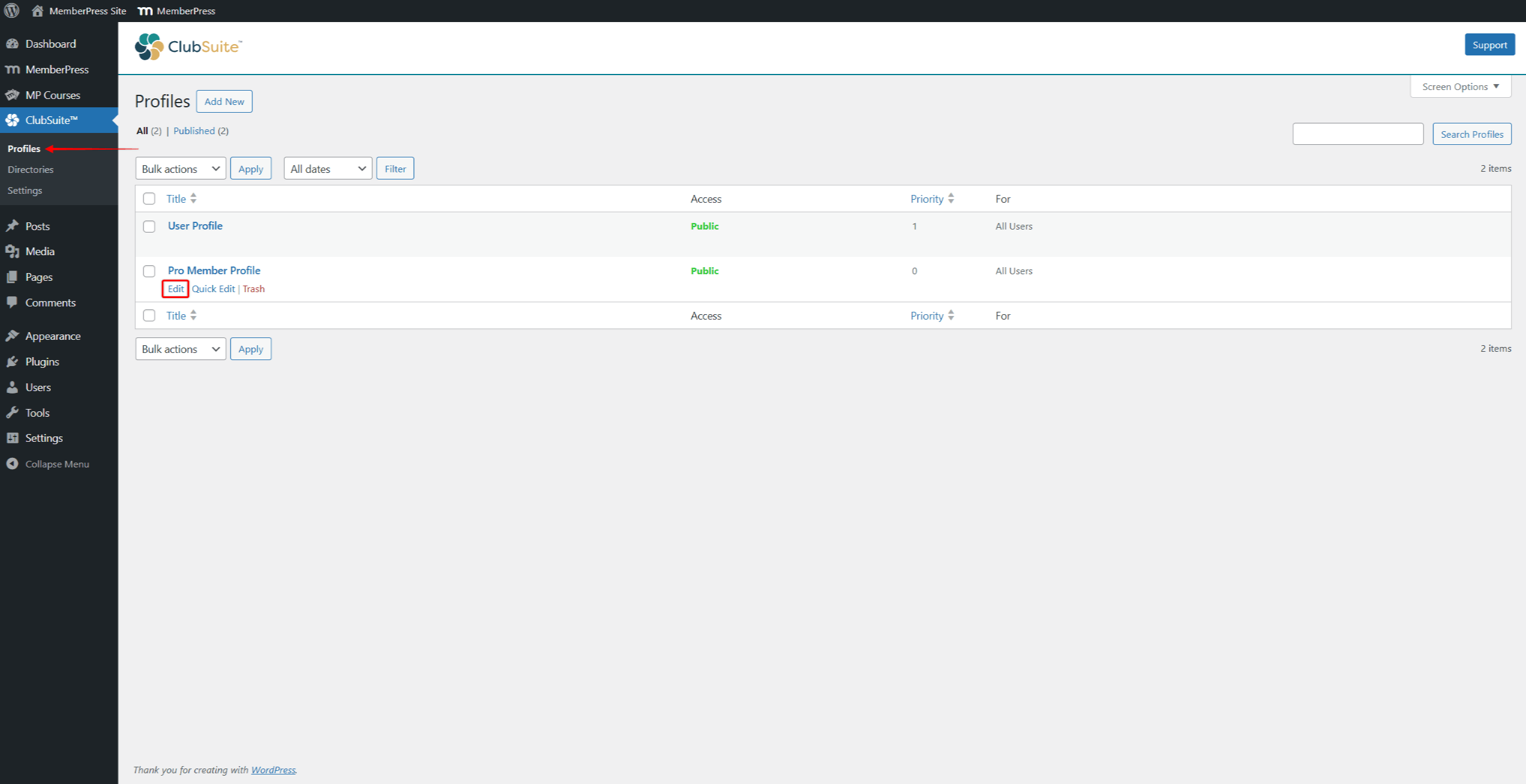
- Click the Block inserter + icon.
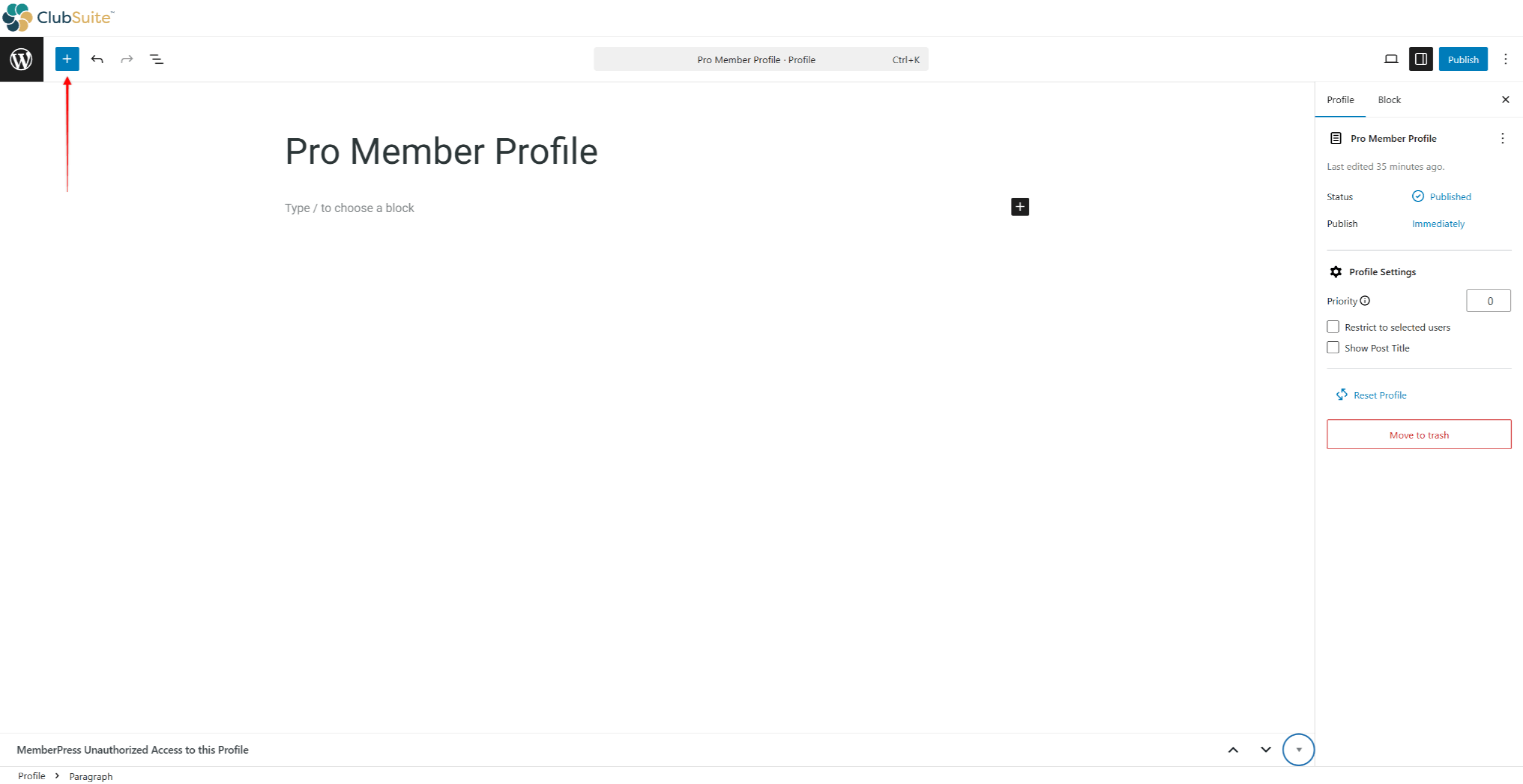
- Next, click the Patterns tab, and scroll down to the Strater Content group.
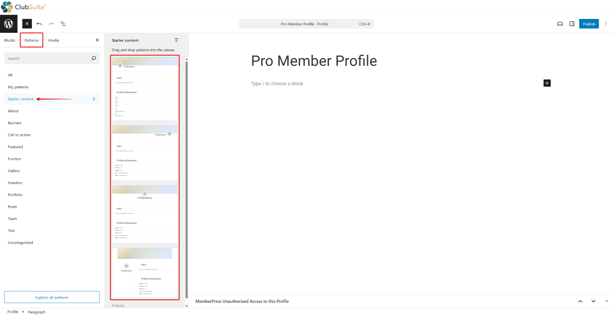
- Select your preferred pattern to add it to the Profile.
Patterns are groups of Profile blocks. You can add or remove Profile blocks, add any additional Gutneberg blocks, and customize each block to match your brand.
Working with Profile Blocks
The Profile blocks are individual components you can use to design your member profiles using the default (Gutenberg) editor.
Each MemberPress Profile block is used to display member-specific data on users’ Profile pages and comes with extensive customization options:
- The Profile Header Block spans over the full width of the profile card. Configure background colors, enable cover images, control height, and add overlays for text readability.
- Profile Section Blocks organize content into logical groupings. Add titles, customize backgrounds, control padding, and apply borders for visual separation.
- The Profile Photo Block displays member images with size controls, shape options (square, rounded, circular), border treatments, and fallback images for members without photos.
- Profile Cover Blocks show banner images, allowing personal expression. Set default covers, control dimensions, adjust positioning, and add overlays, ensuring content visibility.
- The Profile Name Block presents member identities with format options from first name only through formal full names, plus typography controls and supplementary text for titles.
- Profile Icons Blocks add any icon to your profiles. Use this block to add icons to headings, or anywhere on the profile page. You can choose any available icon and set its sizing, spacing, and colors.
- Profile User Fields Blocks display information from member profiles and custom fields. Select which fields appear, control labels, arrange in columns or lists, and handle empty fields intelligently.
Profile User Fields
The Profile User Field block dynamically adds user data to their MemberPress profiles. You can use this block within the Profile Section Blocks or anywhere else on the profile page.
To import a single piece of user information to a profile, you need to add and configure the block:
- While editing a profile, add the Profile User Field block using the block inserter.
- Click the block you inserted to open its Settings in the right-hand panel.
- Configure the block using the Field Settings panel:
- Field: choose the MemberPress field in this dropdown. Accordingly, the block will display data from the selected field on the profile page. For example, to display a user's username on their profile, choose Username in this dropdown;
- Show Label: by default, this option is enabled. Hence, the field label will be displayed on users' profiles together with the field data. If you toggle off this option, this block will display only the data;
- Label Text: you can add custom label text to this field to disaply it instead of the default label.
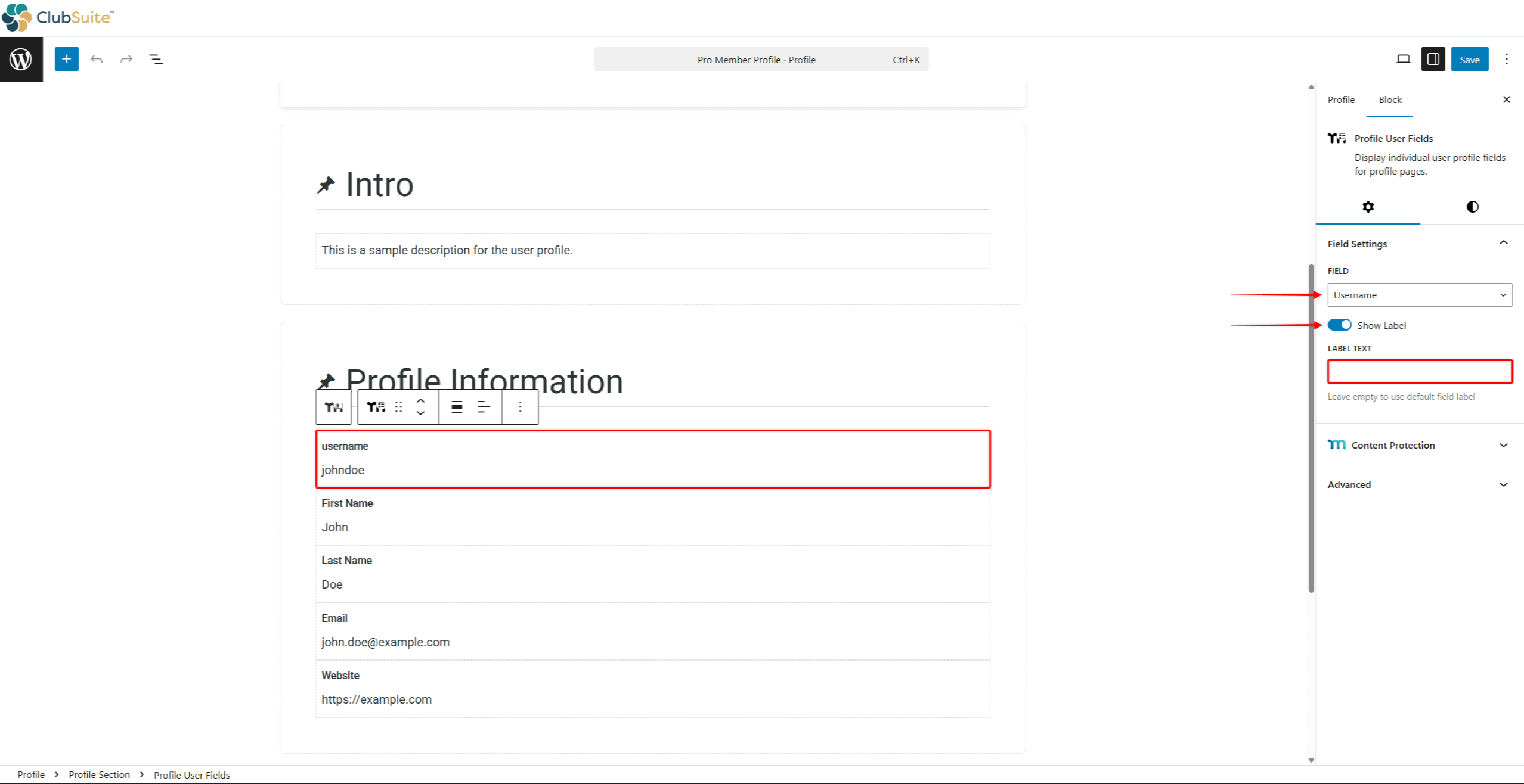
- Save changes to apply them to user profiles.
Using this block, you can add any default or custom MemberPress field used on your registration and account pages.
Adding and Configuring Profile Header
MemberPress Profile Header block imports the default profile header to your profiles. It already includes Profile Cover and Profile Photo blocks and supports social media links.
To add and configure the profile header, follow these steps:
- Start editing your profile.
- Click on the block inserter, and search for “Profile Header”. Click on the Profile Header block to import it.
- Once imported, click the block to open its settings. Under the block settings, set the Photo Position to Left, Center, or Right.
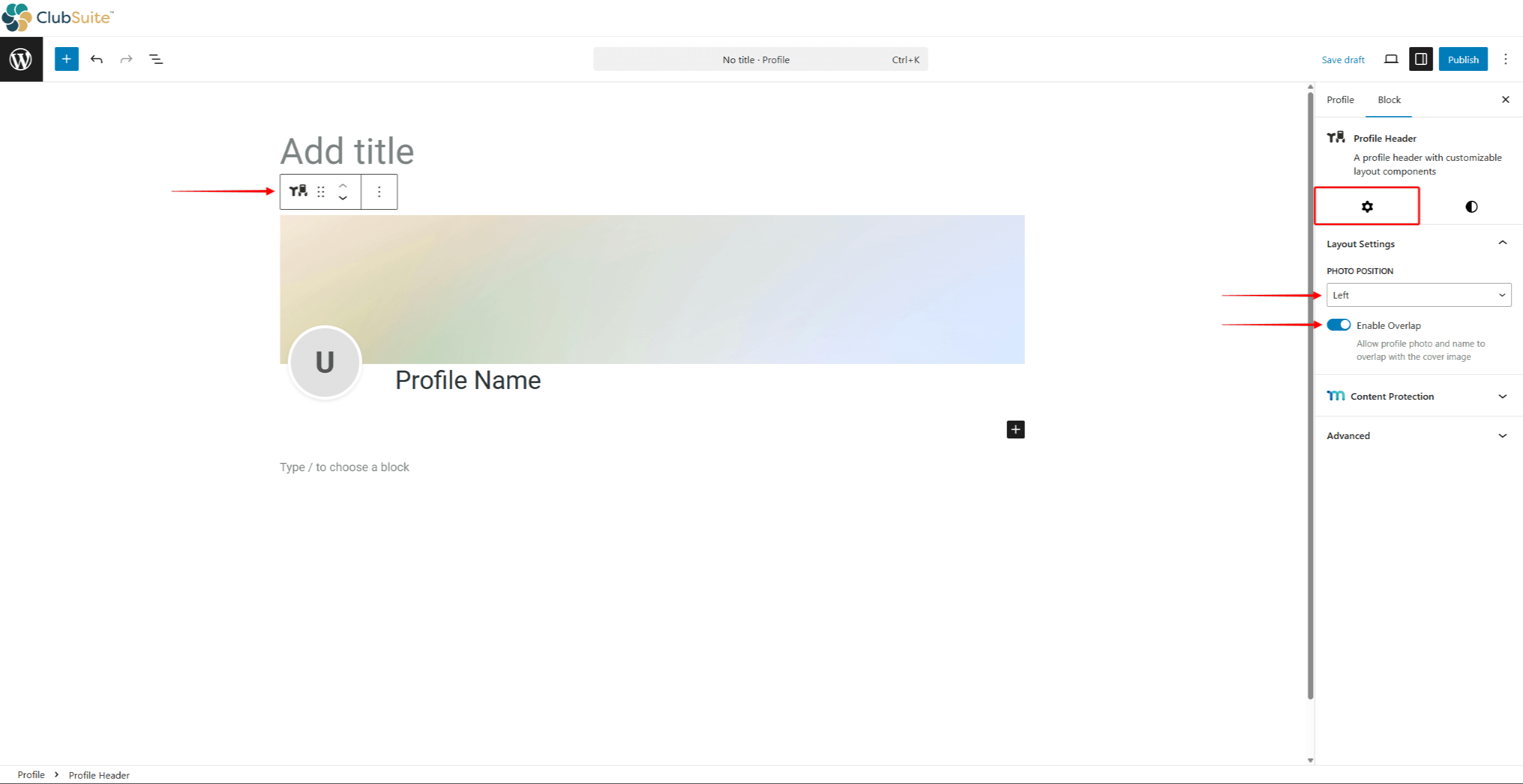
- Also, you can choose to toggle off or on the Enable Overlap option. By default, this option will be enabled, allowing the profile photo to overlap with the cover image.
- Finally, you can style the header. Click the Style tab to access the styling options.
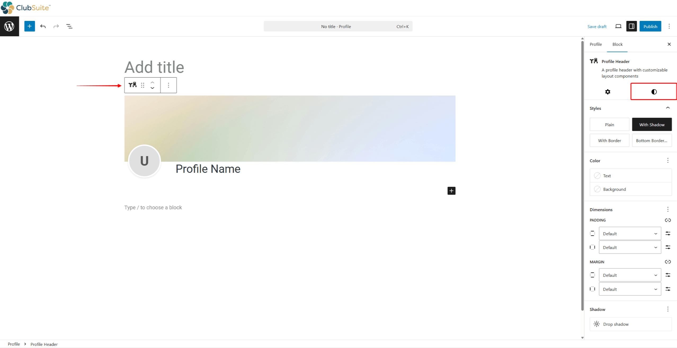
- Click Publish / Save to apply changes.
Alternatively, you can add Profile Cover and Profile Photo blocks individually instead of using the Profile Header block. You can use this method if you are building a custom profile design.
Designing Profile Header
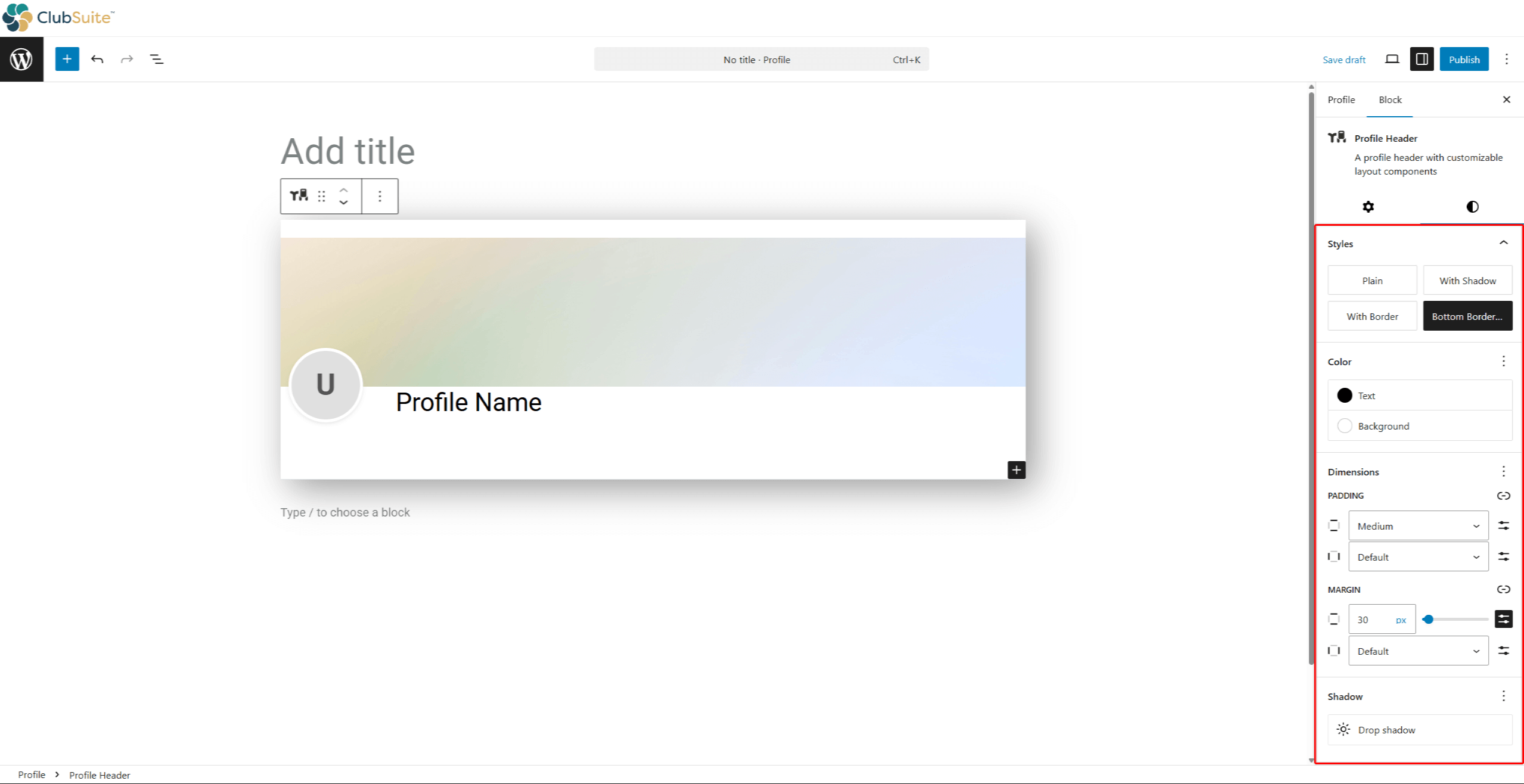
When styling your profile header, you can configure the following blocks:
- Profile Header block:
- Styles: choose one of the four available header styles (Plain, With Shadow, With Border, or Bottom Border);
- Color: set the header background and text colors;
- Dimensions: customize header padding and margins;
- Shadow: set the header shadow by clicking the Drop shadow option.
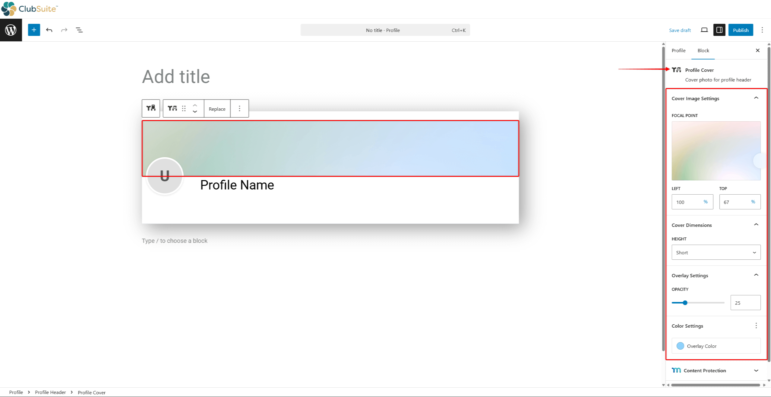
- Profile Cover block:
- Focal Point: move the focal point to the desired section of your cover image;
- Cover Dimensions: set the cover Height (Short, Medium, or Tall);
- Overlay Settings: add an overlay by setting the Opacity percentage.
- Color Settings: set the Overlay Color.
Adding and Configuring Sections And Data
The MemberPress Profile Section block is used to group user data fields and any additional blocks.
To add and configure the profile section, follow these steps:
- Start editing your profile.
- Click on the block inserter, and search for “Profile Section”. Click on the Profile Section block to import it.
- Click on the block you imported. In the right-hand-side panel, click the Settings tab.
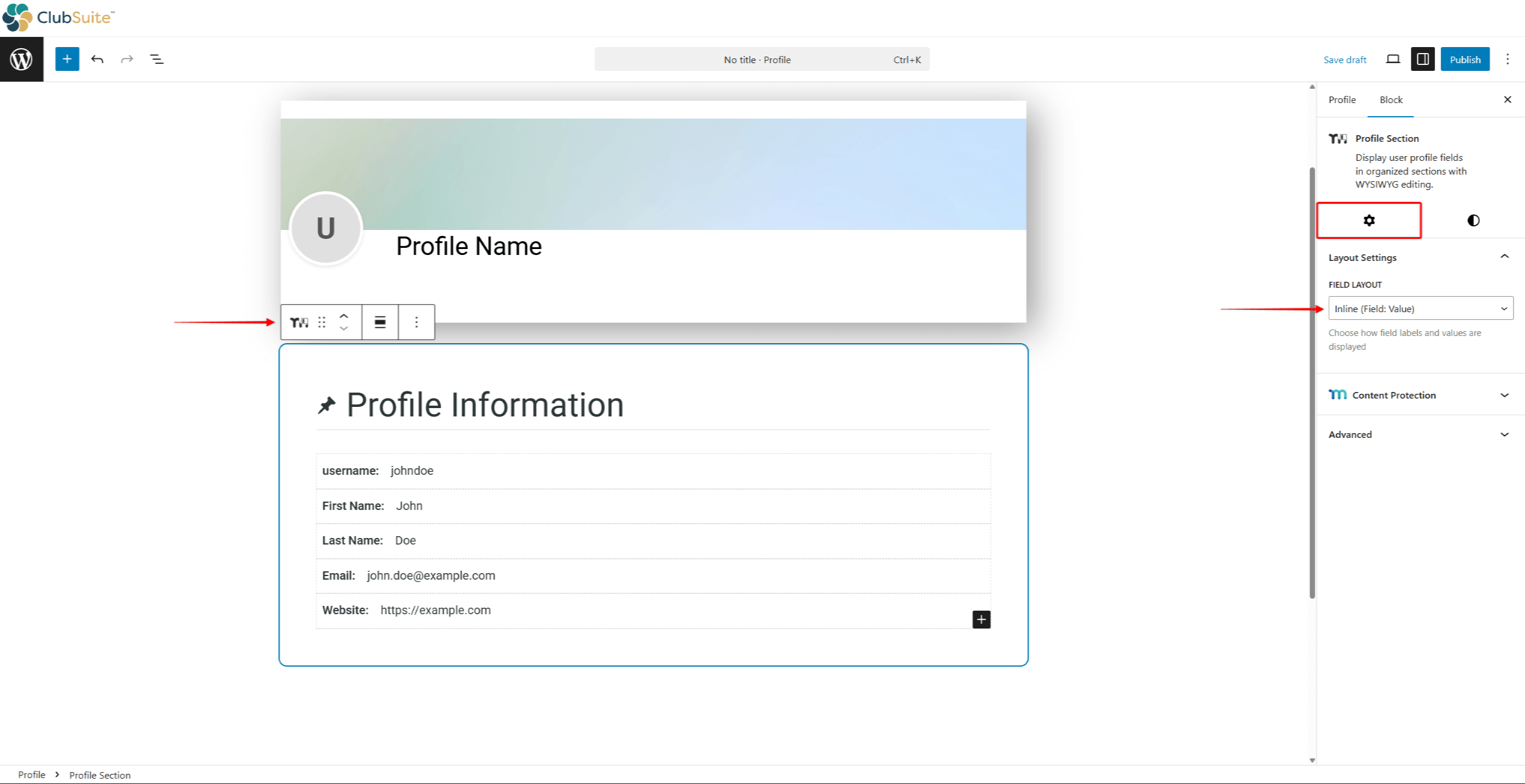
- Expand the Layout Settings panel, and set the Field Layout:
- Inline: this option will display the field label and data in the same line;
- Stacked: this option will stack the field label and data, displaying the data below the label.
- By default, the profile section block will be imported with a default heading and several profile data fields. You can modify the default content if needed:
- Update the heading and heading icon;
- Update the Profile User Fields by choosing the MemberPress fields you need, and/or add the custom label text;
- Add new blocks, or remove the ones you don’t need.
- Finally, click the Style tab to style the section.
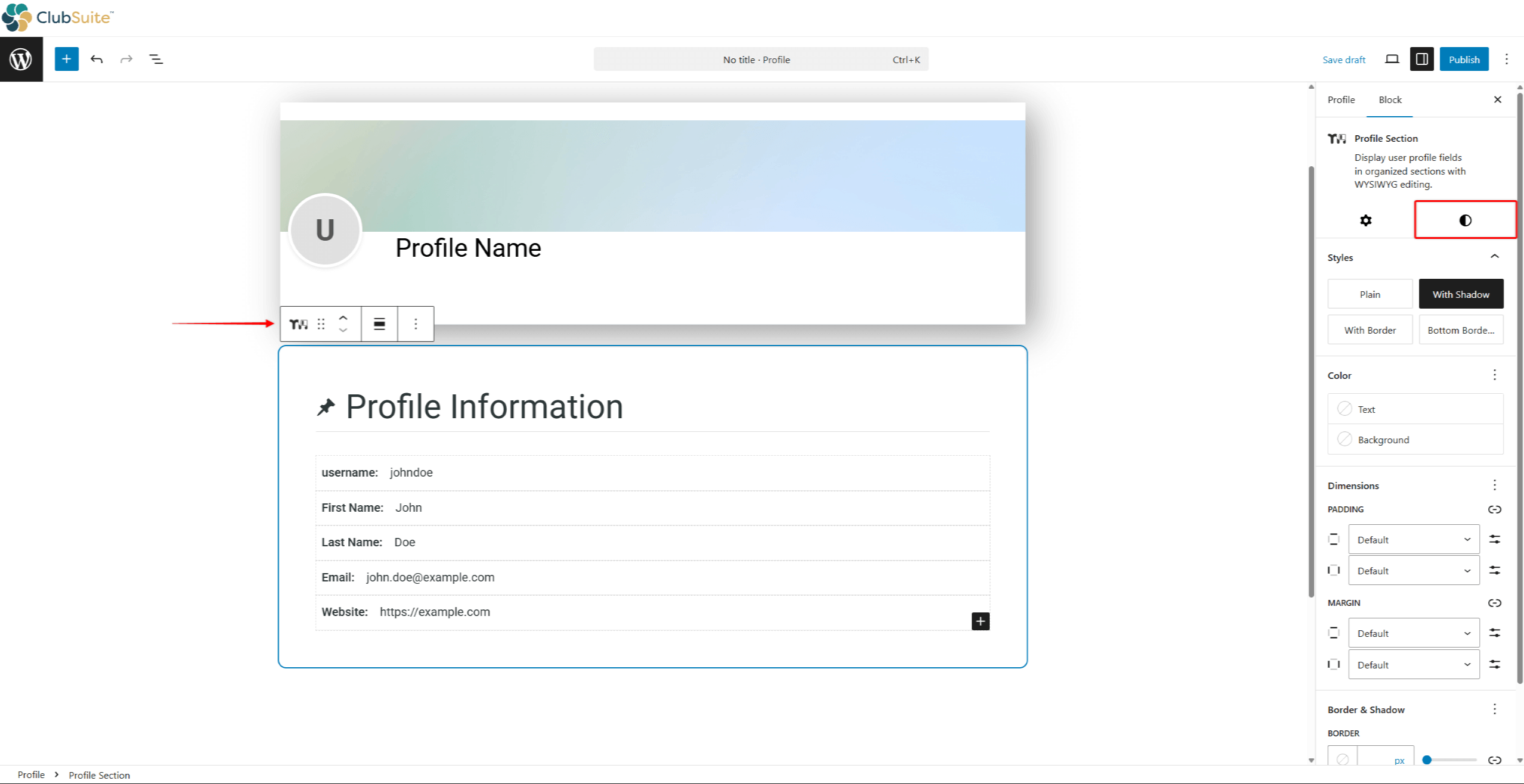
- Click Save to apply changes.
Designing Profile Section
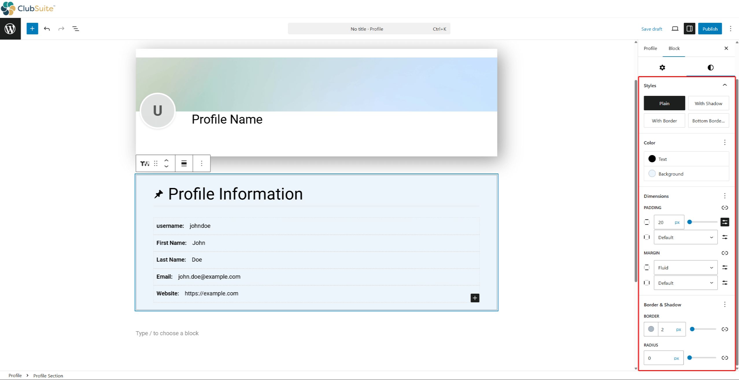
When styling your profile section, you can configure the following blocks:
- Profile Section block:
- Styles: choose one of the four available section styles (Plain, With Shadow, With Border, or Bottom Border);
- Color: set the section background and text colors;
- Dimensions: customize section padding and margins;
- Border & Shadow: set the section border size and radius.
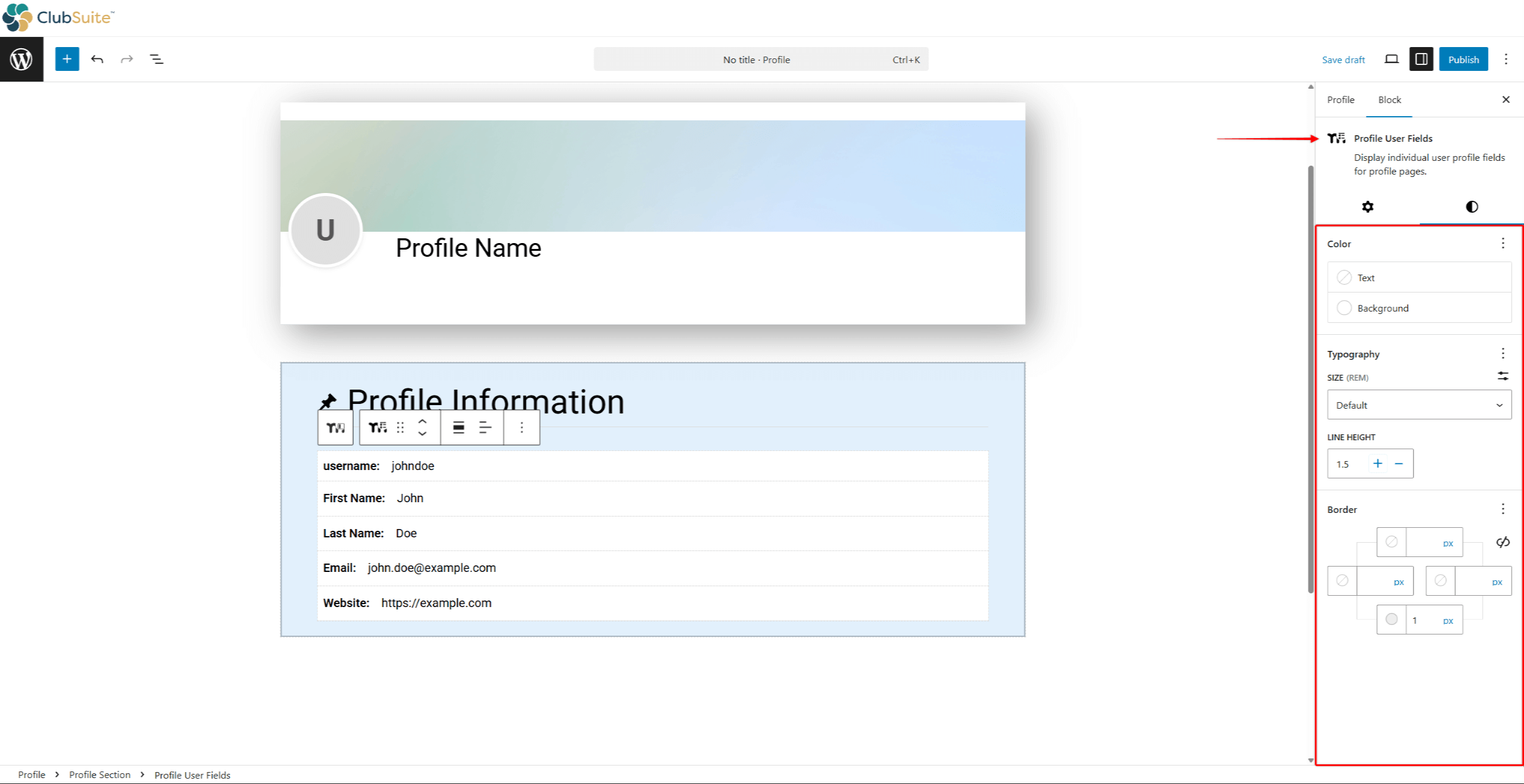
- Profile User Fields block:
- Color: set the field background and text colors;
- Typography: set the font size and line height.
- Border: set the field border size.
