Online course ads that grab attention and resonate with your target audience are a great way to boost conversions and stand out in an increasingly crowded elearning market
With thousands of courses competing for the same limited pool of potential students, the right ad can make all the difference in ensuring your course captures interest.
If you haven’t explored course advertisements as an option for your online course business yet, we’re here to convince you with solid reasons why you should.
By the end of this post, you’ll have learned actionable strategies for crafting compelling visuals and copy, and optimizing your ads for performance.
Why Online Course Ads Are Important
Gone are the days when creating an irresistible course was enough to attract students, especially those who were fascinated by learning online.
These days, creating ads is important if you want your online course to beat the fierce competition in the elearning industry and get your target audience to sign up.
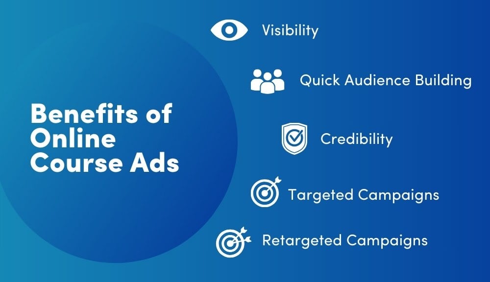
The main benefit is visibility. By paying for ads, you’re ensuring that your brand gets seen by members of your target audience.
Unlike other methods such as organic search content, there is a guarantee that your course ad will be seen.
This is a major benefit for course owners and academies who are just starting out. It takes a considerable amount of time and effort to build an audience organically.
Paid ads, on the other hand, can get your content out there in front of the people who are most likely to want to sign up to your course much more quickly.
This increased visibility also leads to credibility. Repeated exposure builds recognition and trust among potential students making conversions more likely.
What’s more, you can precision target the exact demographic that will be exposed to your ad. You can also use retargeting to reengage people who have shown interest in your online course ad without enrolling.
However, how much your course ads can achieve depends on your planning and overall strategy including:
- Where you publish your ads
- Which ad format you choose
- The effectiveness of your copy and messaging
We’ll go over these points and more in the sections below.
Where to Publish Your Ads
Your first step is to decide which channels are the most appropriate for your brand. In other words, where is your target audience most likely to find your online course ad?
For example, if you’re promoting a course on professional career growth, LinkedIn is a great option. That’s where you’ll find working professionals interested in gaining something tangible from your course.
Likewise, if the course you’re promoting is about intercontinental dishes, social media platforms like Instagram and Facebook would be much preferable because that’s where your target audience would most likely be.
To get the most out of your ads The unique thing about picking a platform to publish your ads is that you have to know how to utilize all the features present
Here’s a simple list of platforms and the features they have to get your ads published in the best way possible:
- Reels: Let’s you do 90-second ad videos
- Stories: Lets you put up creative and engaging course ads for only 24 hours
- Instagram Feed: Lets you create a solid visual course ad with the right caption to captivate your target users when they scroll
- Stories: For short and appealing video ad content that lasts for 24 hours
- Video Ads: For long-form video ad content
- Messenger Ads: Users who see your ads on Messenger are prompted to initiate a conversation with your online course business
YouTube
- Skippable In-Stream Ads: Ads are included in user videos, which users can skip
- Non-Skippable In-Stream Ads: Ads are included in user videos, which users must watch from start to finish
- Discovery Ads: These ads appear in YouTube search results, related videos, and the homepage
- Bumper Ads: Six-second non-skippable ads perfect for delivering a quick, impactful message
- Sponsored Content: Ads can be sponsored content that appear directly in the LinkedIn feed, making it a native ad format
- Video Ads: LinkedIn’s advanced targeting ensures that your video ads reach the right audience
- Text Ads: These are simple and direct ads that appear on the sidebar of the LinkedIn interface and are cost-effective for driving traffic to your course landing page
- Sponsored Messaging (InMail): These ads come in the form of personalized messages sent directly to LinkedIn users’ inboxes
Search Engines (Google)
- Google Search Ads: Allows you to target users who are actively searching for online courses or related topics
- Google Display Network: The Google Display Network allows you to use image or video ads to reach users across millions of websites, apps, and Google-owned properties like YouTube
- Discovery Ads: Discovery ads allow you to reach users in moments when they’re open to discovering new content, offering broad visibility across multiple platforms
- Ads Retargeting: Lets you re-engage users who’ve visited your site or engaged with your ads but haven’t enrolled in your course
Bonus Point! Your Existing WordPress Website
You can also add your course ads to your website.
This is a great option if your site already attracts a good number of your target audience. But either way, it doesn’t hurt to upsell your course to existing members.
If you’re on WordPress, you can easily create an ad using a reusable Gutenberg block. You have free rein to create any kind of ad you want: video, image, text, etc.
And if you’re a MemberPress user you can go a step further by adding your course ad content into a MemberPress protected Gutenberg block.
With this feature you can make sure you ad content is only visible to people who haven’t yet purchased your online course on your site. Or you can show different ads to different members of your site to target your messaging more effectively.
AdSanity is another great plugin to help you manage ads on your site. In fact, we use it ourselves to cross-promote content on our blog.
Interested? Check out our 6 Best Ad Management Plugins For WordPress Membership Sites to know more!
Ad Formats: Long/Short-Form Videos vs. Images
Ad formats such as long/short-form videos and images play a major role in determining the success of your advertising campaign.
It’s best to use a combination of these formats, especially if you’re catering to a diverse audience across different platforms.
However, if you have a limited ad budget or want to convey a very specific message, you’ll need to consider the pros and cons of each format to help you decide which is best.
Here are the pros and cons of each ad format to help you know which best suits your advertising needs:
Long-Form Video
Pros
- Lets you tell a detailed story that engages your audience
- Perfect for explaining complex products or services
- Provides more room for creativity, allowing for a mix of storytelling techniques
- Offers increased viewer retention for interested audiences
- Builds stronger emotional connections between your target
audience and your brand
Cons
- Higher production costs and time
- Not compatible with some platforms like Instagram
- You demand a longer attention span than most people are able to commit to
Short-Form Video
Pros
- It’s quick and engaging
- Great for boosting brand awareness in a short period of time
- Requires less production time and resources
- It’s easily shareable, making it better for organic reach
Cons
- Limited message depth
- It may not offer an emotional impact
Images
Pros
- Easy to create for quick messages
- Offers high visual appeal
- Incredibly versatile for various platforms
- It’s the most cost-effective for production
- Suitable on static platforms and is less disruptive
Cons
- It can be easily overlooked
- Low engagement compared to videos
After considering the pros and cons of each of the ad formats above, you should now know where to use them and where not to and which of them to choose based on what you believe is the ideal fit for your target audience.
Crafting a Strong Message and Effective Copy
Whichever format you choose, whichever platform you choose, the messaging on your online course ad is paramount.
Whether your copy is delivered as a script in an online video, or written as a PPC ad campaign, it mist be strong, impactful and to the point.
Your target audience must watch your ad and say, “Wow! I need to check this out ASAP!”
That’s what an online course ad with an attention-grabbing headline, concise and persuasive body text, and an action-oriented call to action (CTA) can do.
Here’s how to craft each component effectively:
Headlines: Attention-Grabbing, Clear, and Benefit-Driven

Your headline is probably the first thing your target audience will notice. You want to ensure you give off an impeccable first impression – one that’ll linger in their minds.
Carefully craft a headline that’s clear, concise, and directly communicates the benefit of your offer.
Don’t try to be too witty by using vague words instead opt for simplicity and focus on a specific value proposition that resonates with your target audience.
For example, a headline like “Master Affiliate Marketing in 30 Days” is powerful because it clearly states the benefit (mastery) and the time frame (30 days), making it both attractive and actionable.
Tips for Online Course Ad Headlines
Here are some other things to consider:
- Use power words that invoke emotion and excitement such as “free,” “proven,” “easy,” “guaranteed”
- Highlight benefits that are tangible and relatable. Clearly state what the audience will gain
- Try to include a number. In our experience, ads with numbers lead to higher conversions. E.g. “Voted #1 Course”, “Get Fluent in 30 Days”
- Make it actionable. Suggest an action or result that the audience can achieve.
Examples of Effective Headlines
- Learn Spanish Fast – Fluent in 3 Months!
- Power words: Fast, Fluent.
- Benefit: Learning Spanish in a short period.
- Double Your Sales with Proven Marketing Strategies
- Power words: Double, Proven.
- Benefit: Increased sales.
- Discover the Secret to Effortless Weight Loss
- Power words: Secret, Effortless.
- Benefit: Easy weight loss.
- Unlock the Power of Mindfulness in Just 10 Minutes a Day
- Power words: Power, Unlock.
- Benefit: Achieving mindfulness with minimal time investment.
- Get Fit at Home – No Equipment Needed!
- Power words: No Equipment, Get Fit.
- Benefit: Fitness achievable without special tools.
Remember to optimize your headlines for the platform where your course ads will be placed. For example, short and punchy headlines are best on social media platforms like Instagram so that users can easily grab them, given their short attention spans.
However, a longer headline is best for other platforms, like your landing page, to offer more context or a compelling promise related to the courses you’re offering.
Overall, the key is to ensure that your headline is benefit-driven, clarifying why your target audience should care and what they’ll gain by engaging further.
Body Text: Concise, Persuasive, and Aligned with the Audience’s Needs
After you’ve created an attention-grabbing headline, the next step is to write your body copy in a persuasive tone with clear and straightforward language.
Emphasize your target audience’s pain points and how your course easily addresses them, along with other irresistible benefits.
For example, you can mention that your course will help them advance in their career or provide them with unique insights to improve a hobby they’re passionate about.
Saying or promising that your course does something isn’t enough. You need proof to back up your claim, so add relevant testimonials and reviews if possible.
Make it concise, bearing in mind limited ad space and people’s short attention spans.
Call-to-Action: Clear, Action-Oriented, and Urgent

The call-to-action (CTA) is the final and arguably most crucial part of your ad copy. It prompts your audience to take action by clicking the sign-up button for your course.
Your CTA should use action verbs such as “Enroll Now,” “Get Started Today,” or “Download Free Guide,” as they’re direct and tell your audience exactly what to do next.
Also, you need to create a sense of urgency with your CTA to increase conversions.
For example, by using phrases such as “Limited Time Offer” or “Join Before Registration Closes,” you persuade your audience to make a quick decision or lose access to the course.
And if your target audience is already hooked on your course, you can be sure they’ll click that sign-up button faster than the speed of light!
Finally, strategically place your CTA in your ads, be it a button on your landing page or a link on your social media ad, to make it stand out and easily drive clicks.
Examples of Successful Online Course Ads
We’ve discussed how to create impactful online course ads for your online course business. Now, it’s time to show you examples of successful online course ads and the factors that make them stand out.
Here they are below:
Google Search Course Ad

Here’s a simple and impactful Google ad for Amazon’s AWS available on Google’s search results when you search for the keyword “online courses.”
Looking at the image above, the ad clearly has a catchy headline that’s attention-grabbing and benefit-driven. The words used are also clear and simple, with no vagueness or ambiguity.
The CTA recommends users take action by using two important action verbs: “Become” and “Learn,” encouraging learners to take their next steps for success.
Instagram Course Ad

This Instagram course ad by @cfshealth is another fantastic example of a successful online course ad. The man in the real is promoting a 4-week course to help people with chronic fatigue syndrome to manage their symptoms.
He begins with an introductory hook that speaks directly to his target audience “What I wish I’d known about chronic fatigue syndrome”.
He then proceeds to share his personal experience struggling with the healthcare system and explains that his course can help improve recovery outcomes.
YouTube Course Ad
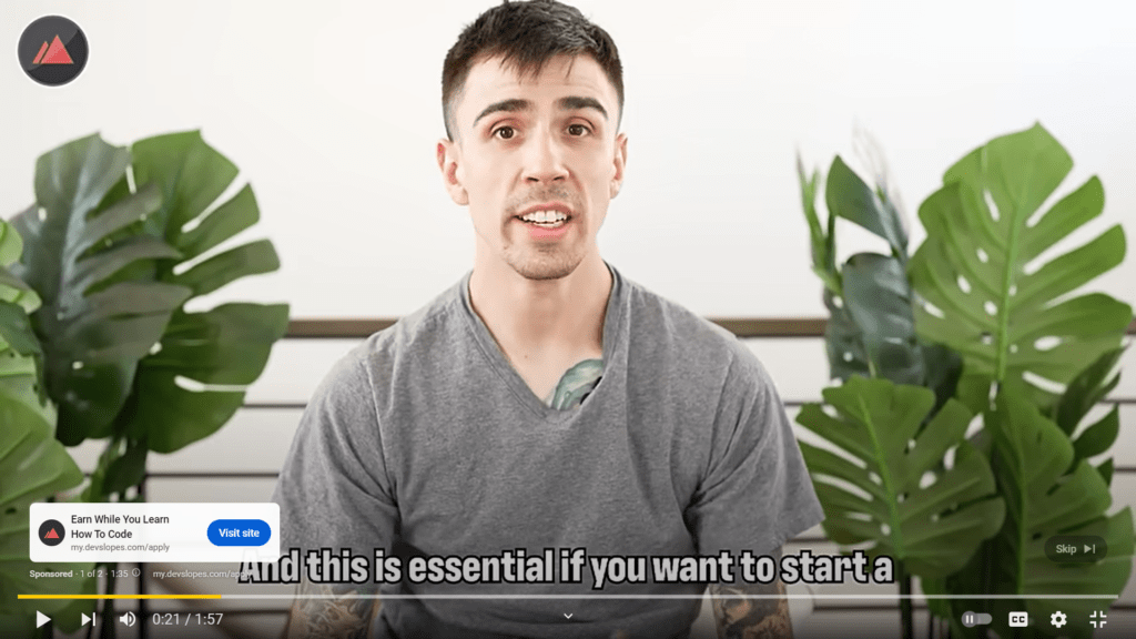
This video is a solid example of a pre-roll YouTube course ad that promotes coding courses from Devslopes.com.
The speaker starts with unique storytelling before delving into the course and the timeframe for you to begin earning extra income with the new knowledge you’ve gained.
Every word mentioned is simple and easy to understand, and an actionable CTA in the form of a link by the side of the video is included to drive people to the course site.
Wow Them With Your Landing Page
You’ve created an online course ad that’s working and drawing interest. However, it doesn’t end here.
You need to consider what happens next after you’ve captured your audience’s attention, which is where creating a well-designed landing page comes in.
A superb landing page is key to converting clicks into enrollments.
If a potential student clicks the link on your course ad and is directed to your landing page, it should carry on the momentum that will lead them to sign up.
Your landing page should be optimized with clean designs, compelling headlines, and a convincing body of text that speaks to your audience.
By doing this, you’ll enjoy certain benefits such as more conversions, reduced bounce rates, competitive advantage, and more.
For tips on optimizing your course landing page for conversions, check out our blog How to Optimize Your Course Landing Page for Conversions.
It covers essential strategies like crafting compelling headlines, creating clear calls to action, and ensuring a smooth user experience, all designed to help you turn visitors into students.
Use Your Website to Cross-Sell Other Courses
Once your audience is on your site, consider adding ads to upsell or cross sell other courses to drive more revenue.
For example, if a student is enrolling in a course on “Beginner Web Development,” suggest related courses like “Advanced JavaScript” or “UI/UX Design” to help them further enhance their skills.
You can easily upsell and cross sell other courses, services and digital downloads at checkout with MemberPress Order Bumps.
For example, if a customer is enrolling in a photography course, the order bump might be an offer for a downloadable guide on advanced photo editing techniques.
MemberPress Order Bumps lets you personalize the customer experience and make more revenue as your customers purchase these additional items.
The fun part is that it’s simple to use! Just pick the products or services you want to feature, then set your pricing options. You can also include an optional message optimized to inspire your customers to buy, and voilà, your checkout page is all set!
This is just one of the many revenue boosting features available to those who create their online course with MemberPress Courses.
Conclusion
Ads are a great way to give your online course a boost of visibility particularly while you’re establishing your brand.
Remember to:
- Choose the right platforms to maximize ROI
- Use a mix of ad formats to engage different segments of your audience.
- Craft a winning message that resonates and drive action
- Continue the momentum with landing pages that convert
Additionally, you can leverage cross-selling strategies with MemberPress Order Bumps to increase your average order value.
Read the related blog posts mentioned in this blog to help you optimize he impact of your ads, drive more conversions, and increase your course’s value.
👉 How to Optimize Your Course Landing Page for Conversions
👉 6 Best Ad Management Plugins For WordPress Membership Sites
👉 How You Can Skyrocket Your Revenue with Order Bumps at Checkout
What tactics have you found effective in creating online course ads? Share your thoughts in the comments below.
And, don’t forget to sign up for our newsletter below to stay updated with the latest trends and strategies in online education.
Thank you for reading and happy teaching!
If you found this article helpful, follow us on Facebook, Twitter, Instagram, and LinkedIn!








Always good to learn new ways to help.
This was really Helpful
Do advertisers find you or are you supposed to contact them?
Love the advice, I can see this bringing in more website traffic.
Thank you. Best of luck, Maggie!
This is fascinating info. Thanx.
Glad to hear it, Chris!
Love this article, tons of great ideas in this post!
We’re glad you loved it! 🙂
Useful step by step guide, a nice starting point and “how-to” advertise my courses!
So glad you found it useful, Igor! It’s great to hear that it’s helping you kickstart your course promotions. If you have any questions or need more tips along the way, we’re here to help!