Conversions are a crucial metric for any website, and probably one you keep a close eye on. If you've been struggling with getting your numbers where you want them, taking steps to improve your website's user experience (UX) could be helpful.
While user experience can cover many aspects of your website's setup, there are some key areas you can focus on to help boost your conversion rate. By making a few tweaks to your site, you should be able to reduce user friction and create a more enjoyable experience for your visitors.
In this article, we'll give you a brief introduction to UX and why it's so important. Then we'll share five tips on how to improve user experience to help you get more conversions. Let's go!
An Introduction to User Experience (UX)
In a nutshell, user experience is how a person feels when they're interacting with your website. These feelings can range from frustration at not being able to complete a task to delight at quickly finding precisely what they're looking for.
The way your website is designed and how it operates are critical factors in the type of experience your users will have. If you can ensure that potential customers don't encounter obstacles as they navigate throughout your site, you'll increase your conversion rate.
How to Improve User Experience to Get More Conversions (5 Key Tips)
Now that you have a basic idea of what UX is and how it influences conversions, let's explore a few ways to improve your website's User Experience.
1. Create a Seamless Checkout Process
Even if the rest of your site is customer-friendly, it's still possible to lose conversions during checkout. There are a few areas to pay attention to during this last, crucial step in your sales funnel in order to improve user experience.
First, be sure to offer a variety of payment options. In addition to accepting credit cards, consider enabling digital payment solutions such as PayPal or Google Pay. Many people have accounts with these companies already, which makes checking out even faster and easier for them.
If possible, offer free shipping. Many customers are put off by unexpected costs that show up during checkout, and shipping expenses are a frequent offender.
You may be able to build your shipping costs into the price of your products. Otherwise, consider offering free shipping to customers who spend over a certain amount or who are part of your loyalty program.
Next, be mindful of how much information you ask users to input. Try to keep checkout forms minimal and ask only for what's necessary to the process. You can always follow up with an email asking for more data once you've made the sale.
Finally, if customers will be creating accounts at checkout, make any specifications for usernames or passwords clear. Having a password rejected for not meeting an unknown requirement is an extremely frustrating experience.
2. Make Your Site Easy to Read
If visitors struggle to read your website, it won't be easy to convert them. Fortunately, thoughtful attention to fonts is an easy way to improve user experience. When choosing fonts, be sure they're legible as well as stylish. You'll also want to check that your text is large enough to read on any screen size.
When writing for your website, keep paragraphs short and scannable by using headings and lists. Most people skim online content rather than reading it deeply.
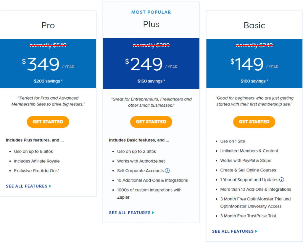
Don't forget about your pricing information. Presenting your prices in a table can make it easier for potential customers to understand your available tiers or packages:
Making your prices easy to find and understand is especially important if you provide your users with many choices.
3. Add Video to Your Landing Pages
Landing pages are an essential sales tool, but they can quickly become cumbersome. This is especially true if you offer different types of memberships, products, or services.
When encountering large amounts of text, some users may click away rather than invest the time to read it. To avoid this, you might include a video that succinctly explains what you have to offer.
While your video doesn't need to include all the information contained in your landing page copy, you'll want to cover the most important points. Outline your offers and provide pricing. You might also include some testimonials from satisfied customers to help convert viewers.
4. Test Your Site's Performance
Most people find slow websites to be incredibly frustrating. Even a delay of 100 milliseconds can reduce conversion rates. If visitors aren't staying on your site long enough for it to load, they can't become paying customers.
You can use Google's Page Speed Insights to test your site's performance. You'll also receive actionable feedback on how to improve it:
Tinkering under the hood of your website can be a bit intimidating. If you prefer, you can outsource performance-related tasks to a maintenance service.
5. Improve Your Calls To Action (CTAs)
Your calls to action (CTAs) are a large part of a successful conversion, as you're explicitly asking a visitor to take action. However, writing a compelling CTA is only half the battle. You'll also want to carefully consider where you place them in order to improve user experience.
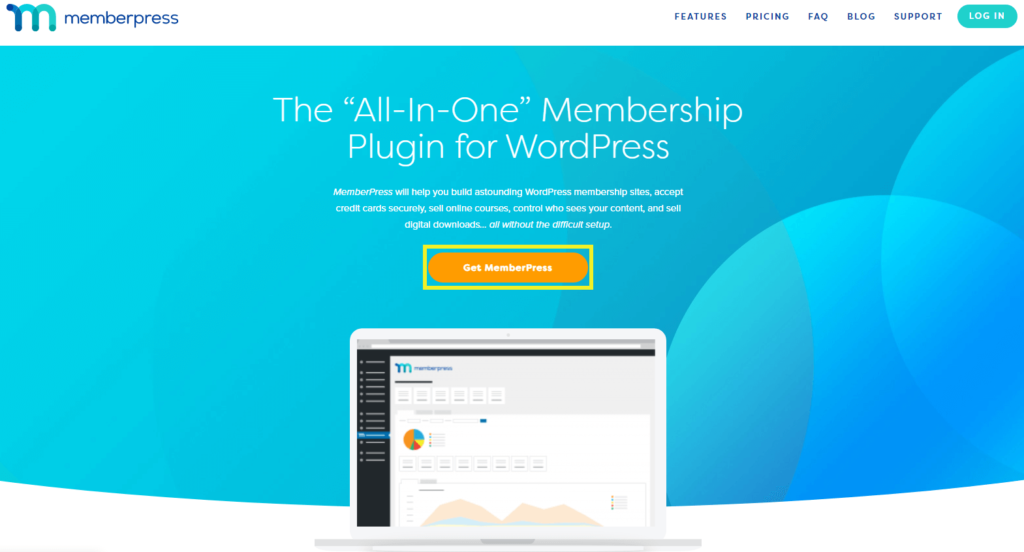
It's best to place a CTA somewhere above the fold, meaning that a visitor will see it before having to scroll. This is especially true on landing pages:
You also want to avoid cluttering multiple CTAs together, as this can create confusion for your visitors. Finally, choose colors for your buttons that are eye-catching and make your text easy to read.
Conclusion
Knowing how to improve user experience can go a long way toward helping you get more conversions. Improving the UX on your website is a big job, but by taking it one step at a time, you can create a friendlier environment for your visitors.
When addressing UX, keep the following elements in mind:
- Create a seamless checkout experience.
- Make your site easy to read.
- Add video to your landing pages.
- Test your site's performance.
- Improve your CTAs.
Do you have questions about how to improve user experience? Ask away in the comments section below!
If you liked this article, be sure to follow us on Facebook, Twitter, Instagram, and LinkedIn! And don't forget to subscribe in the box.


Add a Comment