Optimize your online course landing page for conversions and watch your revenue soar. We share the best tips and examples from the MemberPress community.
You’ve created an engaging, well-structured course, a solid marketing strategy and have a healthy amount of traffic on your site, but still your conversions are low.
Why?
It could be because you’ve neglected one important and often overlooked part of the sales funnel: your course landing page.
Creating an engaging landing page that’s optimized for conversions is a small but critical factor that can make a huge difference to your revenue.
In this blog, we’ll talk about the best course landing page optimization strategies and give you tips to help drive your site’s visitors through to sign-up. We’ll also include real-life examples from MemberPress customers to inspire you!
Keep reading to get the response your well-planned courses deserve.
Why Should You Optimize Your Online Course Landing Page
An optimized course landing page offers more benefits than just increasing your conversion rates.
A well-designed and easily navigable landing page helps users quickly understand who you are, what you’re offering, and how they will benefit from your courses.
Here are the top benefits of optimizing your landing page for sales:
Create a Great First Impression
Your course landing page is often your prospective students’ first look at exactly what you have to offer. A landing page alone can make or break the deal.
That’s why you can’t afford to neglect optimizing your course landing page. A visually appealing header with a clear, concise tagline that immediately conveys the course’s value can captivate visitors and make them want to learn more.
Better User Experience
User experience is a crucial aspect of online learning. As a course instructor, you must ensure the best user experience for your prospective students from the very first interaction.
A well-laid-out landing page can enhance the overall user experience by providing a clear way to purchase your course or navigate to other pages on your site for more details.
This helps direct visitors who are curious about what you have to offer straight through the sales funnel through to your purchase page.
SEO Benefits
Rule #1 of search engine optimization (SEO) is to include organic, relevant content around your target keywords and topics. In other words, you want to find plenty of opportunities to talk about your course and what you offer on your website.
Optimizing your landing page improves search engine ranking, making it easier for potential students to find your course through organic search.
Reduced Bounce Rate
Getting prospects to the landing page itself is a lot of effort. And you sure don’t want all these efforts to go in vain.
If visitors land on your course page and are confused, or they’re simply unsold on what you have to offer, all your hard work up to that point is null and void.
Optimized course landing pages reduce bounce rates, keep visitors engaged and invite them to explore your site and offerings further.
Competitive Advantage
While tens or hundreds of courses are available on the same topic, a landing page is the best way to make your courses stand out.
By showcasing professionalism and attention to detail, you can make your courses appear more appealing to potential students.
To differentiate your offer, you can highlight unique features of courses, expert instructors, additional resources, etc.
All these will help a prospective student decide to choose your courses over others.
Better Conversions and Sales
Ultimately, an optimized landing page leads to better conversions and increased sales. By clearly communicating your course’s value and addressing potential concerns, you can turn more visitors into enrolled students.
Best Practices for Online Course Landing Page Optimization
Now that you know how important optimizing your course landing pages is, it’s time to get to it!
Creating a landing page is easy, but creating one that converts requires a bit more effort. You have to go the extra mile to make sure you address any questions your leads may have, and persuade them that your course is perfect for them.
We have done the research and put together a list of best practices to help you create a stellar landing page for your course.
Hook Users Instantly with Compelling Headlines
Compelling headlines play a key role in capturing the attention of potential students and setting the tone for the value your course will deliver. Here are a few things to consider when writing effective headlines:
1. Keep It Clear and Direct
Your headline should instantly convey what the course is about.
Avoid jargon or flouncy phrases that might confuse your audience. Your goal is for anyone glancing at your headline to immediately understand the promise of your course.
2. Highlight the Main Benefit
Focus on the primary benefit that your course offers to the student. This could be gaining a specific skill, achieving a particular outcome, or solving a common problem.
Make sure this benefit is clear and compelling to draw in your target audience.
3. Use Strong, Action-Oriented Language
Verbs that inspire action or evoke emotion can make your headline more powerful. Words like “Transform,” “Master,” “Launch,” “Achieve,” or “Discover” can be very effective in making the headline more dynamic and engaging.
4. Include Numbers or Data
If applicable, use numbers or data to make a headline more attractive. For example, “Increase Your Revenue by 50% with Our Advanced Sales Techniques Course” is specific and quantifiable, making it more compelling.
5. Pose a Question
Asking a question can pique the reader’s curiosity and encourage them to read on for the answer. The question should relate directly to the reader’s aspirations or challenges.
MemberPress customer Bulletproof Musician has an impactful opening message on the landing page for their Performance Psych Essentials course. It reads:
“What if practicing could…
Be more efficient and effective?
Transfer better to the stage?
And become an activity that is almost…fun?
(It totally can be – read on to learn how)”
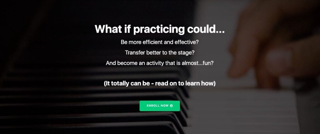
These questions serve to explain to the reader what this course can help them achieve.
6. Use Testimonials or Social Proof
Adding elements of social proof, like a quote from a successful student or a statistic from your course outcomes, can enhance credibility and attract interest.
For example, “Join 10,000+ Students Who Have Advanced Their Careers with Our Course!”
7. Test and Optimize
Finally, always be prepared to test different versions of your headlines. A/B testing can reveal what works best with your audience, allowing you to refine and optimize your approach based on actual data and feedback.
Implementing these tips can make the difference between whether a visitor is going to scroll down and explore more, or heading over to your competitors.
Persuade Visitors with Clever Copy
Your landing page copy is your pitch, your hello, and your best chance to make a friend out of a visitor. Here’s how to make your words count and genuinely connect with your future students:
8. Spotlight Benefits and Outcomes
Let’s cut to the chase: What’s in it for them? Make it crystal clear what students will gain by taking your course. Think more “Launch your startup by learning real-world tactics” and less “Course completion certificate.”
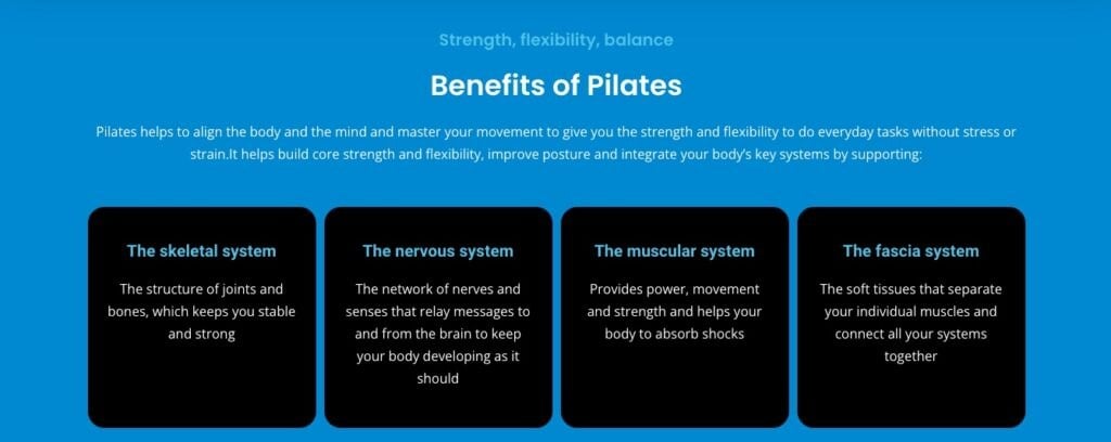
MemberPress customer Pilates Guy successfully achieves this by including. a visually appealing “Benefits” section on the landing page for his “Pilates On Demand” program:
9. Speak Their Language
Use words that stir up emotions and get people excited about the possibility of transforming their lives.
Phrases like “unlock your potential,” “turn your passion into a profession,” and “overcome the hurdles holding you back” can create a vibe that resonates more deeply with their aspirations.
10. Tell a Story They Relate To
Everyone loves a good story, especially one that mirrors their own challenges and dreams.
Start with a problem they recognize, show them the journey through your course, and finish with a vision of success that feels within their reach.
If it’s your personal story, even better! Let your learners see how you’ve benefitted and how you can relate to their challenges and frustrations.
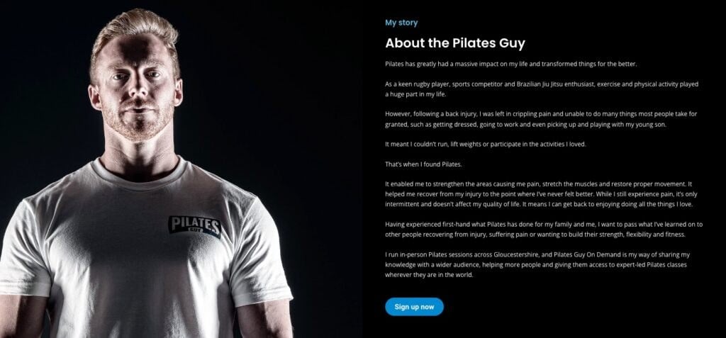
Pilates Guy shares the story of how pilates helped him manage crippling pain and recover from a serious back injury:
11. Shine a Light on What Makes You Special
What makes your course the one they should choose?
Maybe it’s your one-on-one coaching sessions, exclusive resources, or a community of learners who support each other.
Highlight these gems prominently to show why your course is a cut above the rest.
12. Address Their Doubts Head-On
Got worries? Let’s talk about them. Whether it’s time commitment, course difficulty, or anything else, directly tackle these concerns and explain how your course makes things smooth and easy.
“Too busy? Our course fits into your life, not the other way around.”
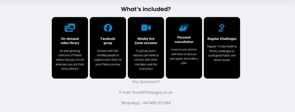
Pilates Guy includes an “Any Questions?” section in his landing page with contact details to invite visitors to reach out so he can address their specific doubts:
13. Listen and Learn
The best way to hit the mark? Know what your audience is thinking. Use quick polls, feedback forms, or even a simple chat feature to hear what your potential students care about, then tweak your copy based on what you learn.
By turning up the charm and making your copy feel like a two-way conversation, you’ll not only capture the interest of your visitors but also build the kind of rapport that turns prospects into students.
Engage Prospects with Striking Visuals
We all judge a book by its cover sometimes. The visuals on your landing page are your front cover, so let’s make them pop! Here’s how you can catch the eye of every visitor with some snazzy visuals:
14. Pick High-Quality Images That Tell Your Story
Think of images that reflect the essence of your course. Choose pictures that are not only beautiful but also packed with meaning and relevance to your content.
If you’re teaching a photography course, for example, showcase some of your best shots that make everyone go “Wow!”
15. Roll the Film
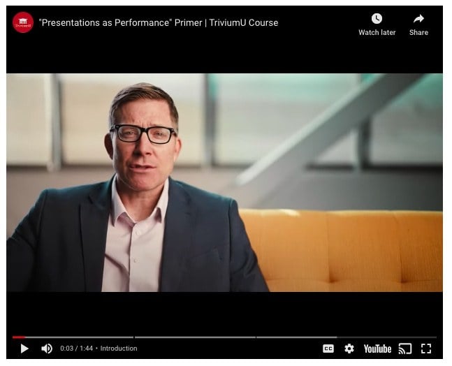
Videos can convey the vibe of your course in seconds. You could create a video that introduces the course, features a few clips of class interactions, or shares success stories from past students.
MemberPress customer, Dr Ben Crosby of TriviumU includes an introduction video for each of his courses on the site explaining his experience, what to expect from the course and how it can benefit you.
16. Infographics for the Win
Got data? Turn those numbers into a story with an infographic. It’s a fantastic way to visually break down complex information or statistics so it’s easy to digest.
Whether it’s the success rate of your students or a breakdown of the course content, make it colorful, clear, and engaging.
17. Speed Matters
Gorgeous visuals are great, but not if they take forever to load. Optimize your images and videos to ensure they’re feather-light and quick to load. A smooth experience keeps potential students happy and engaged, not waiting.
18. Splash of Branding
Remember to sprinkle a little bit of your brand magic on everything. Use your colors, logos, and style to make every visual feel like a part of your family.
By jazzing up your landing page with visuals that are not only eye-catching but also fast and familiar, you’ll keep your prospects engaged and eager to learn more. After all, a picture is worth a thousand words, and a great video? Even more!
Social Proof to Earn Credibility
You know your course is top-notch, but sometimes your prospective students need a little nudge from their peers. That’s where social proof swings into action.
19. Show Off Those Shining Reviews
Place those glowing testimonials where they can’t be missed – right next to your call-to-action buttons, perhaps?
20. Keep It Real
Use real photos and names (with permission, of course) to show that your reviewers are actual humans. This is a) more personal and b) proof that real people have found real value in what you offer.
21. Share Success Stories
Got a student who boosted their career after taking your course? Share that story! Use specific, measurable achievements to show how your course helps people succeed. Think “Boosted their sales by 50% in just three months” kind of specifics.
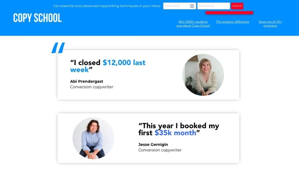
MemberPress customer Copyhackers puts customer testimonials front and center of their landing page for their Copy School course.
They include names and photos of their customers, and success stories with statistics to back them up. In other words, they apply all three of the above best practices for testimonials!
22. Use a Social Proof Plugin
A great way to incorporate social proof across your whole site is by using a plugin like TrustPulse. TrustPulse uses popups to publish details on purchases on your website.
For example a popup might say “47 people have signed up recently” or “Jessa from Utah just signed up!”
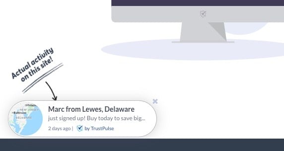
This helps visitors see that others have signed up to your course and trust your company.
Clear Calls to Action (CTAs) for Conversion
Your copy, content, and testimonials are all doing their part, but what really cinches the deal is an effective call to action!
This punchy line is designed to drive your visitors through to sign-up. It’s your rallying cry to inspire prospective students to take that leap and commit to signing up for your course.
You want to create CTAs that are impactful and clearly direct visitors to take action, so pay attention to these best practices:
23. Visibility is Key
Your CTAs should be easy to find and visually distinct from the rest of your page. Use contrasting colors and make sure they’re large enough to be noticed immediately.
24. Direct and Motivating Language
Use straightforward, compelling language in your CTAs. Instead of generic terms like “Submit,” use specific prompts like “Start Learning Today!” to make the action clear and appealing.
25. Urgency Can Help
Adding a sense of urgency can encourage visitors to act promptly. Use phrases like “Enroll Now—Limited Spots Available!” to prompt quick action.
26. Strategic Placement
Include multiple CTAs at various points on your page, such as after important information or at the end of sections. This can help remind visitors of the action you want them to take.
27. Optimize Through Testing
Regularly test different versions of your CTAs to find what works best. This could involve experimenting with wording, colors, or placement to see which variations drive the most conversions.
Optimize Your Online Course Landing Page Today!

Get MemberPress Today!
Start getting paid for the content you create.
Alright, you’ve got the scoop! An awesome, optimized landing page requires a bit of strategic thought. When building your course landing page you should consider:
- Purposeful design;
- Punchy headlines;
- Compelling copy;
- Eye-catching visuals;
- Solid social proof; and
- Crystal-clear CTAs.
Each piece plays its part in both pulling in visitors and converting them into eager students who are ready to learn.
And hey, tweaking and refining your page is part of the fun. Keep your eyes on the data, listen to user feedback, and always be ready to make that page even better.
Want more insider tips? Head over to our blog on The Best Practices for Marketing Your Online Coaching Program. It’s packed with insights that’ll help you market your courses as expertly as you teach them.
Discover more ways to make your marketing efforts shine just as brightly as your educational content!
Don’t forget to reach out to us in the comments if you have any questions or suggestions.
If you found this article helpful, be sure to follow us on Facebook, Twitter, Instagram, and LinkedIn!







Very helpful article. Will definitely change some things accordingly. Thanks.
This was great! Thanks.