A solid sales page can do wonders for your bottom line. But how do you make one?
The driving goal of every online small business owner is straightforward – turning a profit. There are all kinds of things you can do to help achieve that goal, but one of the primary ones is creating a high-converting sales page.
You might be thinking, “That’s good to know, but what is a sales page, why do I need one, and how do I make one?”
Well, keep reading. In this post we’ll explain what a sales page is and what it can do for your business. We’ll also clue you in on the core components that make up an excellent one. So let’s get to it!
What is a Sales Page?
The sole purpose of the sales page is to get page visitors to take some action. This action could be signing up for an online course, buying physical or digital products, signing up for a membership, providing an email address, and so on.
Also called a landing page, your sales webpage is separate from the rest of your website. That’s due to the singular nature of its purpose – to steer your target audience directly down the sales funnel. For this reason, many sales pages don’t even include site navigation.
Following is an example of one such sales page made using the WordPress plugin, SeedProd. As you can see, there’s nowhere on the page where the user can click to navigate elsewhere on the website.
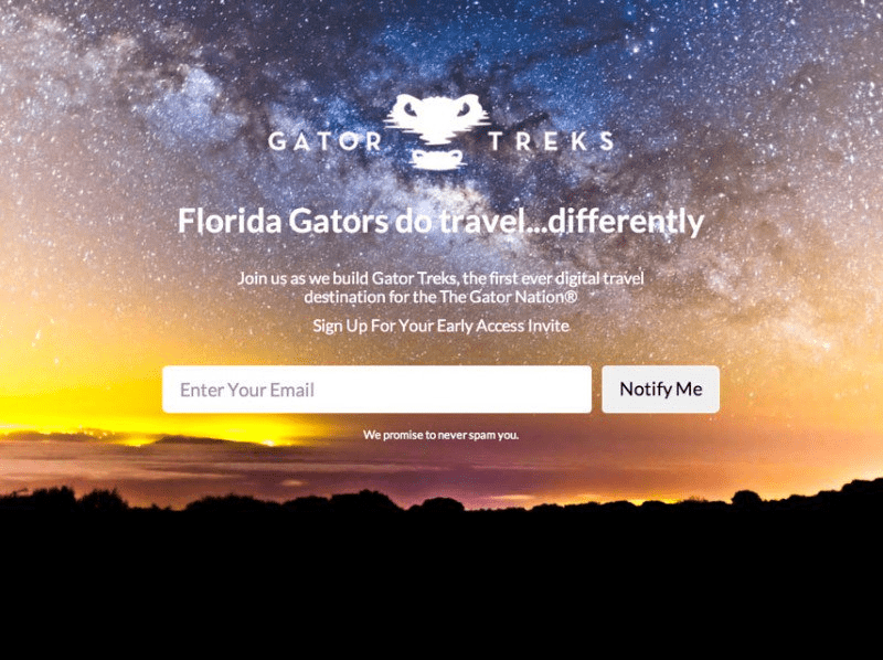
You may also notice that this sales page from Gator Treks is also a coming soon page.
Dual functionality like this is common with sales pages. The page gives curious readers a taste of what’s to come, then encourages them to sign up with a brilliantly placed call to action (CTA).
Characteristics of a Killer Sales Page
Effective sales pages have a few characteristics in common. In general, these pages…
Focus on the offer
A great sales page gives the user what they’re looking for and nothing more. The page is free of fluff like your company history, and typically has no navigational links. It should be distraction-free and narrowed in on the deal and its terms, along with relevant product features.
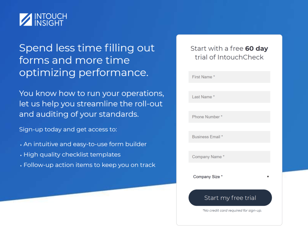
Use simple forms
An effective sales page avoids long, complicated forms. Keep the content short and sweet, focused only on the information you really need. If your deal does require a longer form, break it down into smaller sections and simplify as much as you can.
Use specific targeting
For maximum effectiveness, a solid sales page will be highly targeted. That’s why it’s not uncommon for a single campaign to include multiple sales pages. Put some thought into who you want to reach through your page, then write copy that speaks directly to that person.
Thank the user
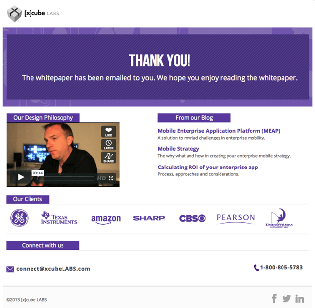
The best sales pages always include some sort of “thank you” message providing confirmation. This can be any number of things – from a popup box to a separate page.
The thank-you message is also an excellent place to further engage the user. For example, the whitepaper confirmation message below directs the user to the blog and features an informational video.
Now that you’ve got a general idea of what a great sales page looks like, it’s time to create your own! Just follow these simple step-by-step instructions.
Step 1: Gather Audience Data
As we said, a great sales page is highly targeted. To pull that off, you’ve got to know something about your target audience.
Developing a persona is a great place to start. A marketing persona is a fictional character representing your ideal customer. It includes demographic info along with pain points, lifestyle elements, and even a description of the day-to-day activities this person might engage in.
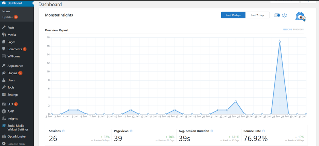
Google Analytics is an awesome resource for the data you’ll need to create your persona. MonsterInsights is a WordPress plugin that brings your Analytics to your WordPress dashboard, making the info fast and easy to process.
Keyword research will also come in handy for targeting. You can use a tool like BuzzSumo to see what topics are trending in your niche.
Also consider taking to social media to see what other people in your niche are discussing. This small bit of insight allows you to get a pulse on who your audience is and what they may want from your sales page.
Step 2: Set Your Objective
Once you’ve identified your audience, you’ll want to consider the goal of your sales page. Do you want to recruit people to your email marketing list? Are you looking to get more sales? Do you have content ready to go to interested subscribers?
Before you design your page, you need to have a clear understanding of what it is you’re trying to do.
Step 3: Design Your Copy & Images
Now you’re at the point where you have an end goal in mind, you know your audience, and you’re ready to create a sales page. If you want to build a magnet that keeps people converting for as long as the page is up you’re going to need some copy and a killer headline.
Here are a couple of tips to help you create a great copy for your sales page.
- Make your copy short and sweet. Use a short, concise header that explains exactly who you are. Use a subheader and add a short blurb explaining how your offer is valuable to the customer.
- Avoid too many CTAs. Try to limit it to one clear CTA (e.g., sign up, buy now, search here, etc.).
- Use your keywords. Doing so will improve overall ranking and help customers find your page.
- Avoid complicated jargon and useless information. You can include a couple of testimonials or a clean chart showing some of the functions/benefits of your product or service, but keep it light and uncluttered.
Here is a great example from Reputation.com:
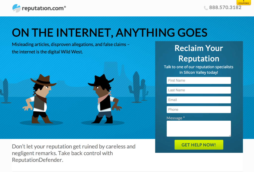
Notice the emotional header and subheader, along with the clear CTA (Reclaim Your Reputation!) with the text box that pops and says “Get Help Now!”
Conclusion
There’s no single template for the perfect sales page. The truth is, your conversions are going to vary based on what you’re offering, who you’re targeting, and what kind of campaigns you’re running to bring in more traffic.
As time goes on, experiment with A/B testing to identify those elements that work best with your audience. Every target audience has different interests and problems that need to be solved. It’s your job to think outside the box and come up with a way to help your users and boost your bottom line.
If you liked this article, be sure to subscribe to our newsletter in the box up to your right!










Add a Comment