A good way to spark interest and entice visitors to convert is by teasing them with a sneak peek of solid content.
Unless they hand over their email or take some sort of action you choose, they won’t have access to this piece of content known as gated content.
This can be in the form of blog posts, videos, checklists, webinars, and more.
When you run a membership site, you rely on gated content to grow your business.
It can help your website and business attract more leads, further its reach and visibility, and build relationships with new subscribers by offering them value.
To decrease the chance of annoying visitors by presenting them with restricted content, make sure you already have a substantial amount of visitors and traffic coming to your website.
If your business isn’t at the right growth rate, gated content will only frustrate and turn off visitors, pushing them to exit out and go somewhere else.
You also want to make sure you’re always offering valuable content not just as a teaser, but for free without exchanging anything. This will show you’re sincere in your efforts to help your audience solve their problems.
Let’s dive in to a few tips for you to use gated content to boost conversions and keep visitors happy.
Gate content at the right time
It wouldn’t be wise to start a brand new website and lock all your content, nor would it be wise to do so when you haven’t gained enough traction.
If your website does not yet acquire a significant amount of monthly leads and organic traffic, it isn’t time to start gating content.
To ensure that your strategy is successful, you have to gate your content at the right time to the right set of visitors.
To do this, find out what stage your visitors are at in your conversion funnel.
You can’t gate content at the top of the funnel when visitors are discovering your brand, exploring what you have to offer, and are contemplating if you’re worth revisiting.
They should be anywhere in the middle or towards the end of their buyer’s journey when they come across gated content. In order to give users the sense of urgency that tells them they have to take the action you present to them, you first need to create motivation inside them.
The best way to do this is to create high quality, valuable content.
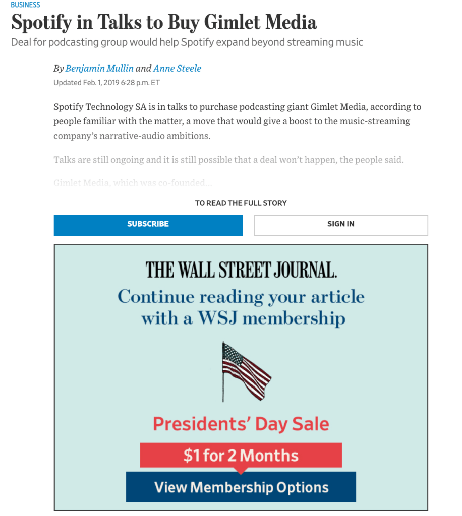
The Wall Street Journal, which sells more than two million copies of their newspaper daily, gates their content successfully because they already have a large, steady following.
Consumers are already familiar with their brand and are willing to subscribe for a membership because they trust the publication.
Delivering quality content to your audience means knowing what answers they need and what problems they need solved. Figure out what questions they’re asking.
Ask them directly through surveys or emails and see what your competitors are doing for their audience.
Using OptinMonster to gate your content
To create gated content, you can use a helpful tool like OptinMonster which has a content locking feature you can operate straight from your WordPress dashboard. Gate content on any website and integrate with all the major email marketing software available.
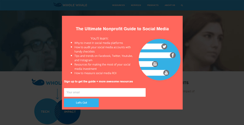
Digital agency Whole Whale was able to increase their email signups by a staggering 100 percent using content locking.
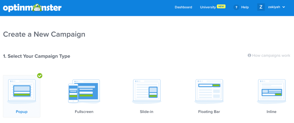
To set up locked content, go to your OptinMonster dashboard where you’re going to create a new campaign. Select your campaign type.
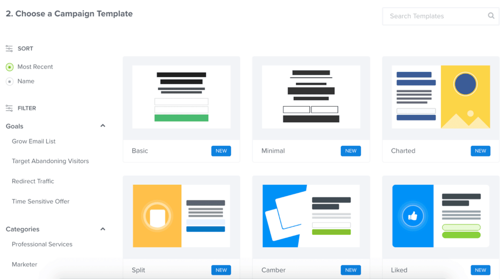
Then, choose a template for your campaign.
Give your campaign a name and click Start Building.
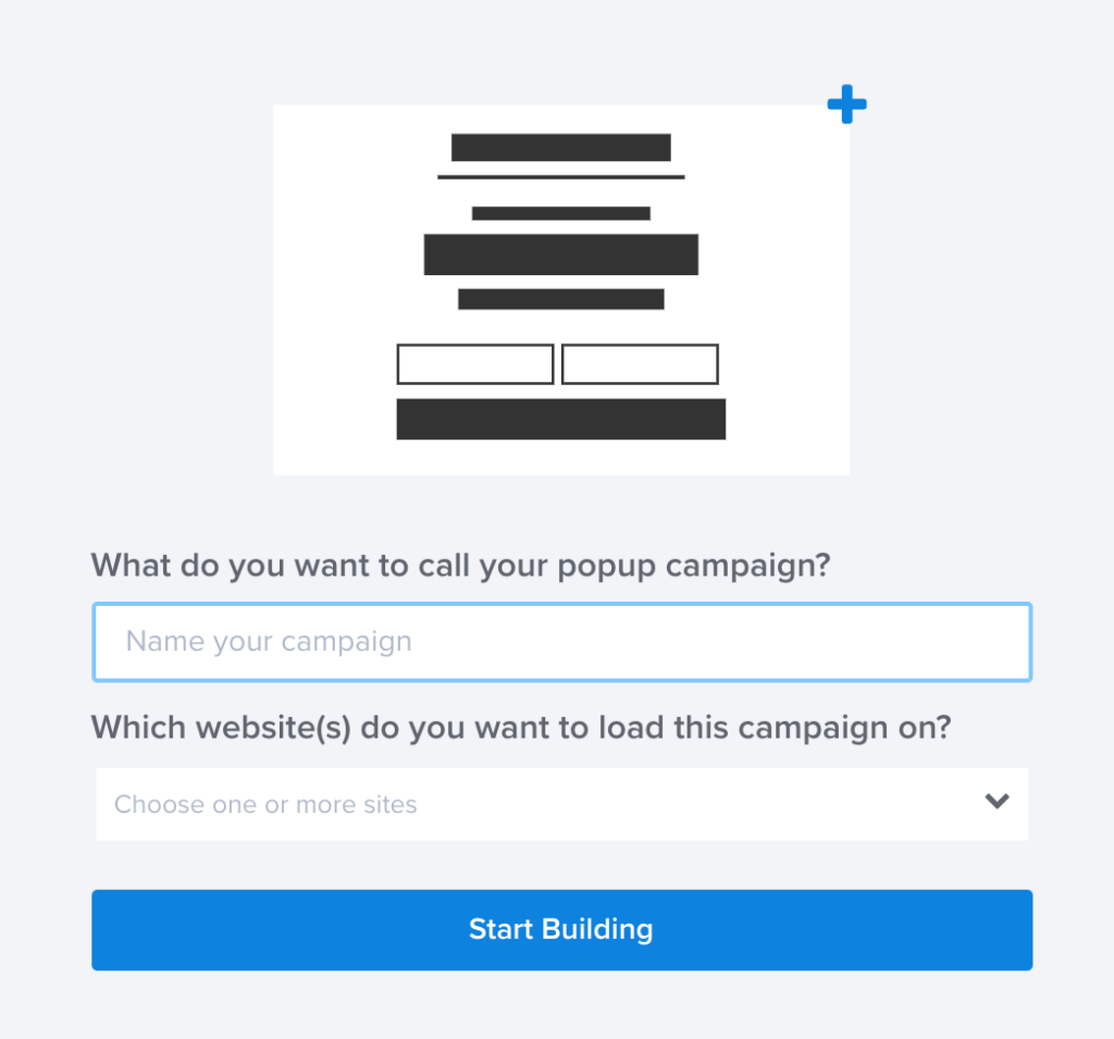
You’ll then be able to customize the design of your campaign. Click Save and your campaign is complete.
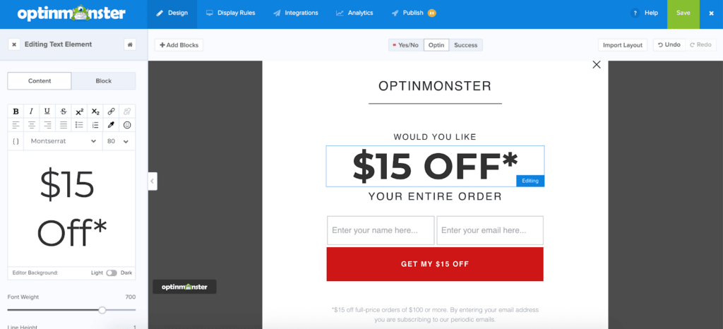
You’ll then be able to integrate your campaign with your email list, view its analytical data, and publish it for visitors to see.
Read More: How To Create Lead Magnets and Optins
Optimize your landing page
If your gated content is being shown to visitors on a landing page, it has to be properly optimized for conversions first.
There’s no point of simply throwing some copy together trying to convince users to hand over their information because they need incentive to want to engage with your brand.
Start by researching what content on your website is most viewed and engaged with by your members This gives you an idea of what content they enjoy and what you need to create more of to continue growing your customer base.
It’s also important to perform keyword research to decide what topics and subtopics your upcoming content will center around and what’s going to attract visitors. Whatever you gate has to be valuable or else it won’t convert at all.
You can use Google Keyword Planner as part of your SEO strategy to find keywords that are high in search and low in competition and tailor your content around these popular phrases for higher visibility.
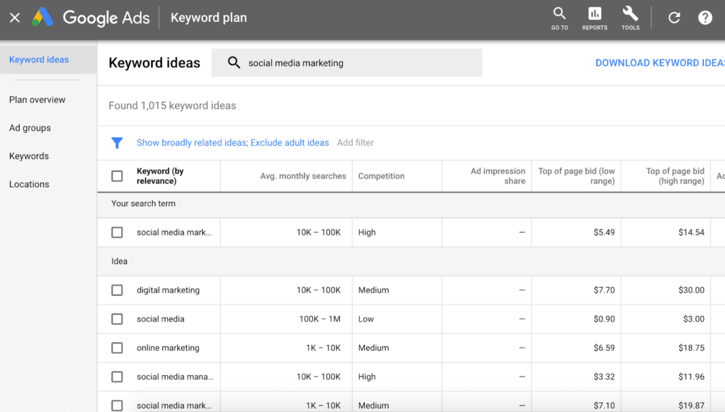
Next, you need to focus on the design and layout of your landing page. Consider the colors you want to use, the copy, any images or videos you might include, and size and placement of the text.
According to a survey by Content Marketing Institute, 51 percent of B2B marketers consider creating visual assets a top priority in their content marketing strategy because its execution is essential in generating leads.
Use A/B split testing to test different elements of your landing page including the color of the CTA button, CTA button copy, form copy, and header text.
HubSpot conducted an A/B test on their CTA buttons with one being red and one green. They found that the red button produced 21 percent more conversions than the green.
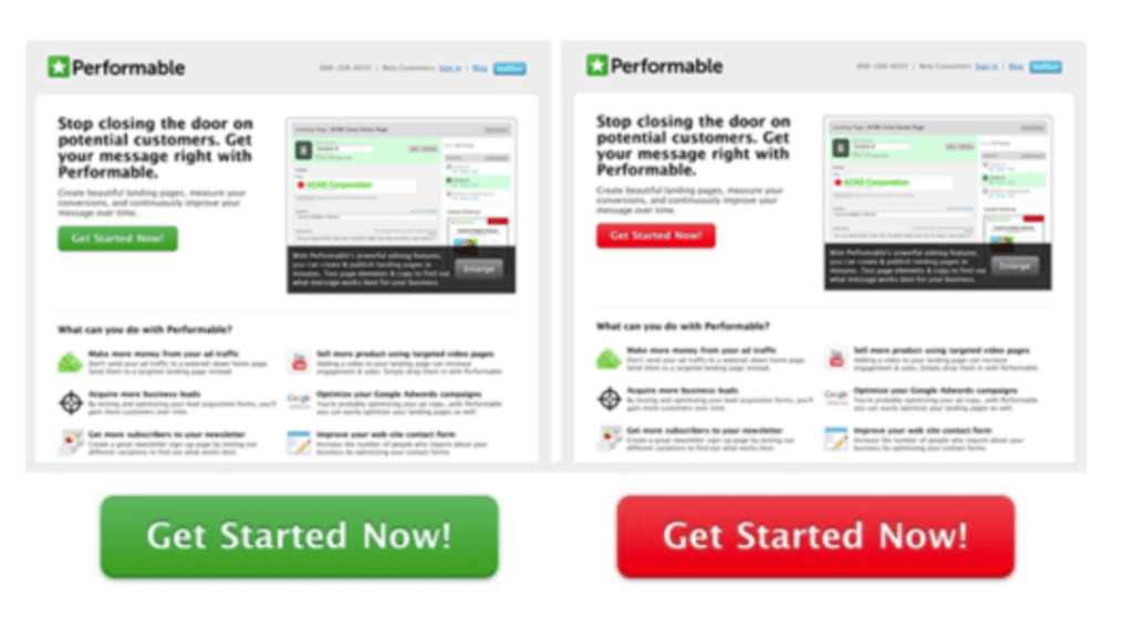
For psychological reasons, red triggered more users to click the CTA button that was red instead of the green.
Knowing this information means they now can tailor their future campaigns to the type of visual experience their users are looking for. Take note of which changes create more conversions and continue streamlining your strategy with this newfound information.
Follow up with new leads
Once you get the information you need – let’s say it’s email addresses – don’t think your conversion strategy is over.
It’s crucial that, once you succeed in receiving the emails you wanted that you check in with your new subscribers and make them feel welcome.
Don’t wait too long to reach out to new subscribers. If too much time passes and then you pop out of nowhere in their inbox, they’ll get confused and unsubscribe thinking you’re another spam bot.
You need to be proactive when it comes to engaging with consumers so your conversion rates can skyrocket. Don’t take longer than a day or two to reach out.
You can create a welcome email series introducing your brand to your new visitors and telling them what you’re all about. Give them some insight into what kind of content they can expect in the future, how often you’ll be reaching out, and any offers or giveaways they don’t want to miss out on.
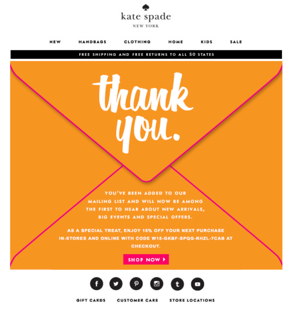
Link subscribers to similar content you think they’ll enjoy and try to make your emails sound personalized.
A study by Experian Marketing Services found that email subject lines that included the subscriber’s name boosted open rates by 29.3 percent.
Your subscribers are human and want to feel like a unique part of your brand. The more you can personalize their experience, the more connected they’ll feel to your business.
Read More: How To Run a Successful Email Campaign
Wrapping up
Gated content can greatly boost your conversions if you know how to make it count. It’s important to remember that gated content doesn’t appeal to everyone, so for consumers at the top of the funnel, it’s a way to turn them off.
Doing your research and creating high quality content is also key to making gated content worth it for users. You also need to optimize your landing page as it’s the web page convincing your visitors to take action.
How will you use gated content to increase conversions? Let us know in the comments section below.
If you found this article helpful, follow us on Facebook, Twitter, Instagram, and LinkedIn!









Hi Laura Cabrera
Many website owners and bloggers have forgotten about these simple tips for so many years now.
Creating Gated Content as you have already mentioned is a great way to be sure visitors stick around.
I like the tips you mentioned about having an optimized landing page.
It’s so silly that some people just don’t get that, so I’m glad you reiterated it here.
I appreciate you for taking out the time and shed some new light on this old topic.
found so much value in this post that I shared it on my blog of course linking back to the original post.
Have a good day.
This post is about gated content but only shows you how to do it with optin monster? No one landing here is looking for strategiies. We want to know how to design the gated content with memberpress.
Great point, Elena! If you’re looking for a step-by-step guide on setting up gated content directly with MemberPress, this article breaks it all down for you: MemberPress Content Protection Rules Thanks for your feedback!